
Built for the Press
Apparel Graphics | Screen Print Production | Vector Illustration
Custom apparel graphics designed for screen print production at J's Silkscreens, built from concept through color separation.
Overview
Most of the graphic design I do lives on fabric. At J's Silkscreens, I design apparel graphics for a wide range of clients, from local businesses and sports teams to concert venues, camps, churches, and community organizations. Every project starts the same way: a client walks in with an idea, a deadline, and a garment color. My job is to take that starting point and build something that works visually, communicates clearly, and holds up through the screen printing process.
This case study walks through how I approach that work. I'll break down a single project from concept to color separation, then pull back to show the range of styles and brand voices I design across on a regular basis.
From Request to Finished Graphic
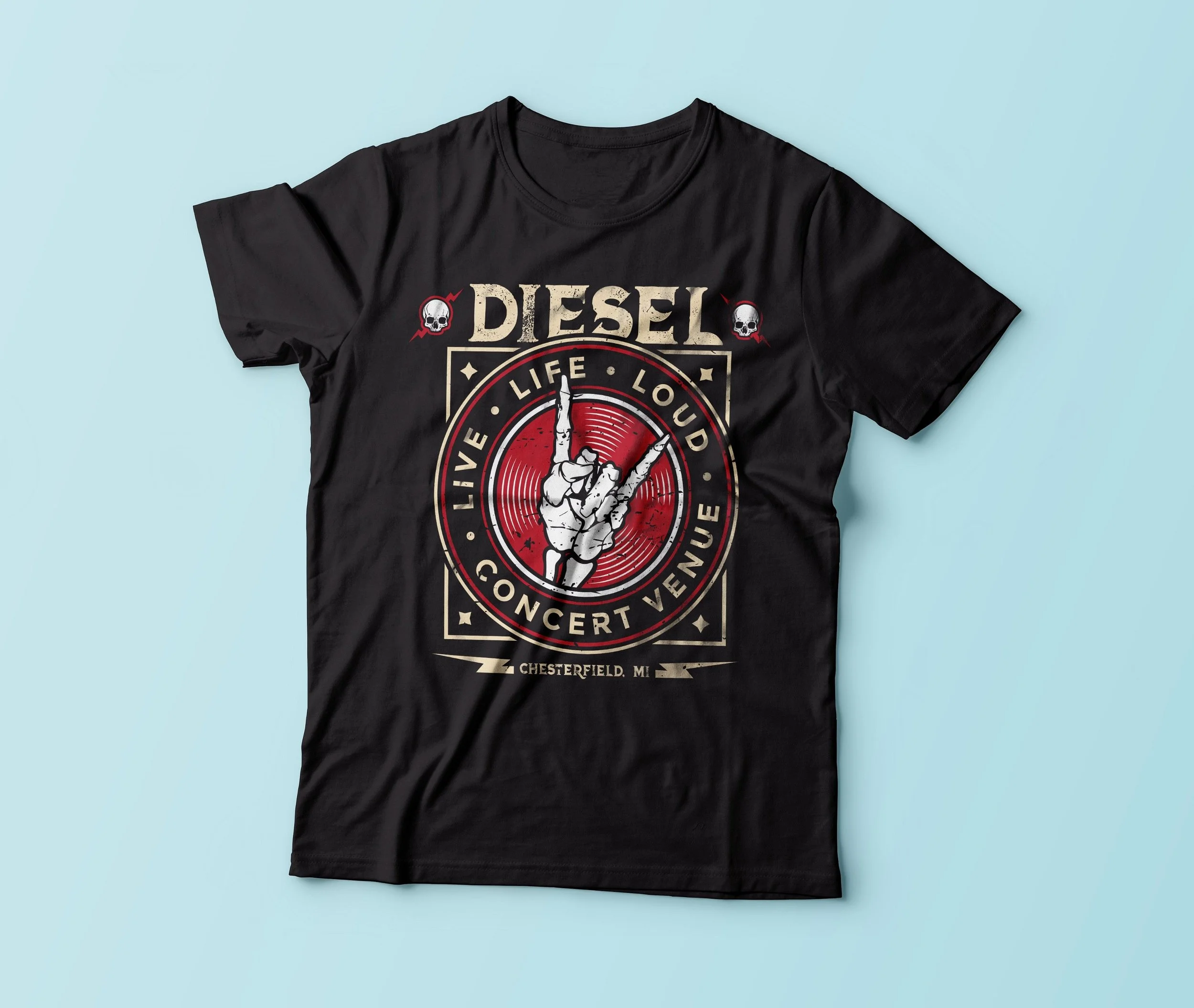
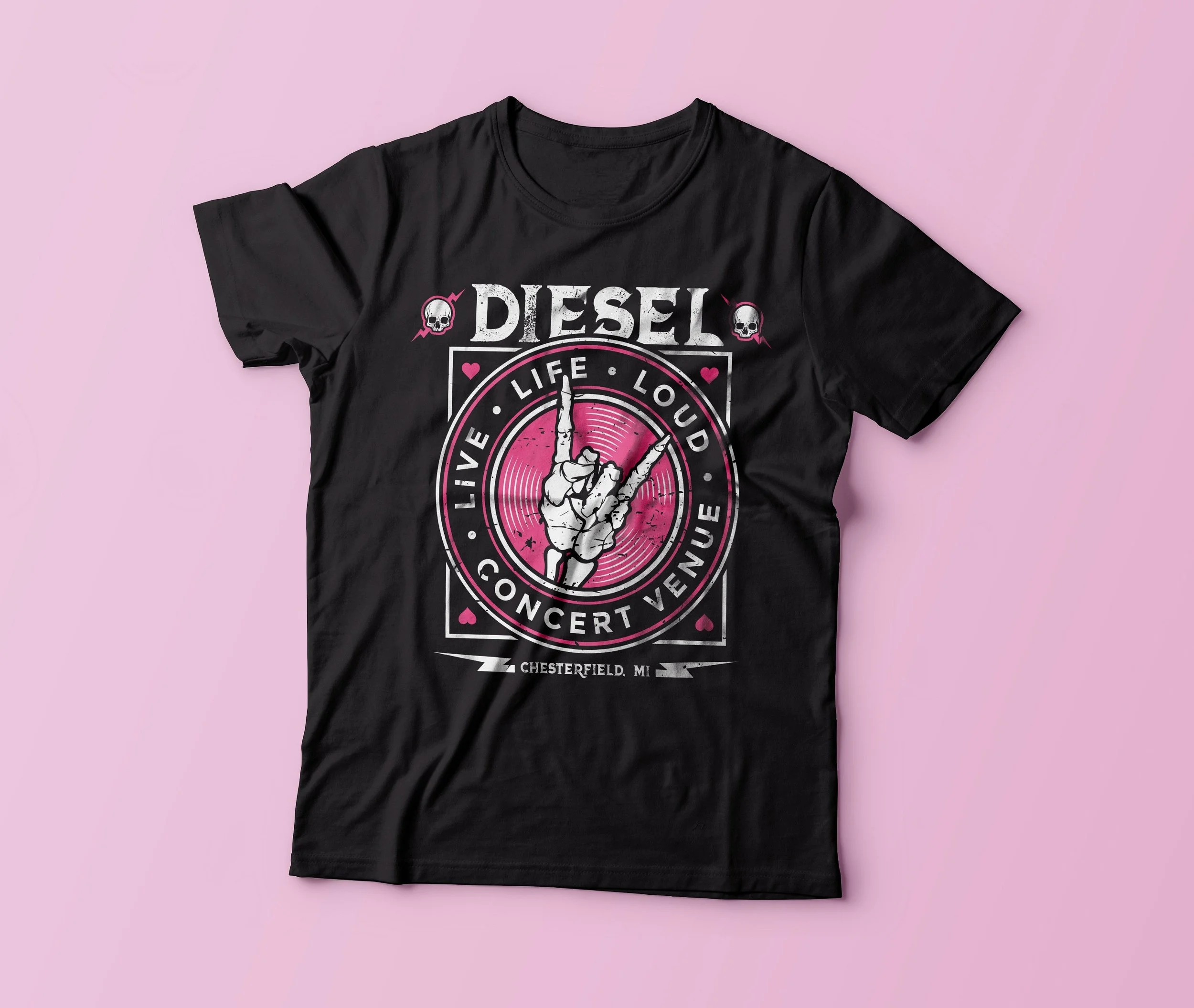
Diesel Concert Venue — Chesterfield, MI
The Diesel project is a good example of how a typical apparel graphic comes together. The client needed a design that matched the energy of a live music venue, something bold, a little gritty, and rooted in rock culture. The garment was a black tee, which meant the color palette and contrast strategy had to be built around a dark substrate from the start.
I started with the composition. A skeleton hand throwing up the rock sign sits at the center, framed by a vinyl record and surrounded by the venue name and tagline: "Live Life Loud." The layout pulls from vintage concert poster and badge design traditions, using circular framing, distressed textures, and bold, stacked typography to create something that feels like it belongs at a show.
The illustration style matters here. I wanted the hand to feel hand-drawn and slightly imperfect, like something you'd find wheat-pasted to a wall outside a venue. That texture is intentional. Clean, polished vector work would have looked out of place for this brand. The grit is part of the message.
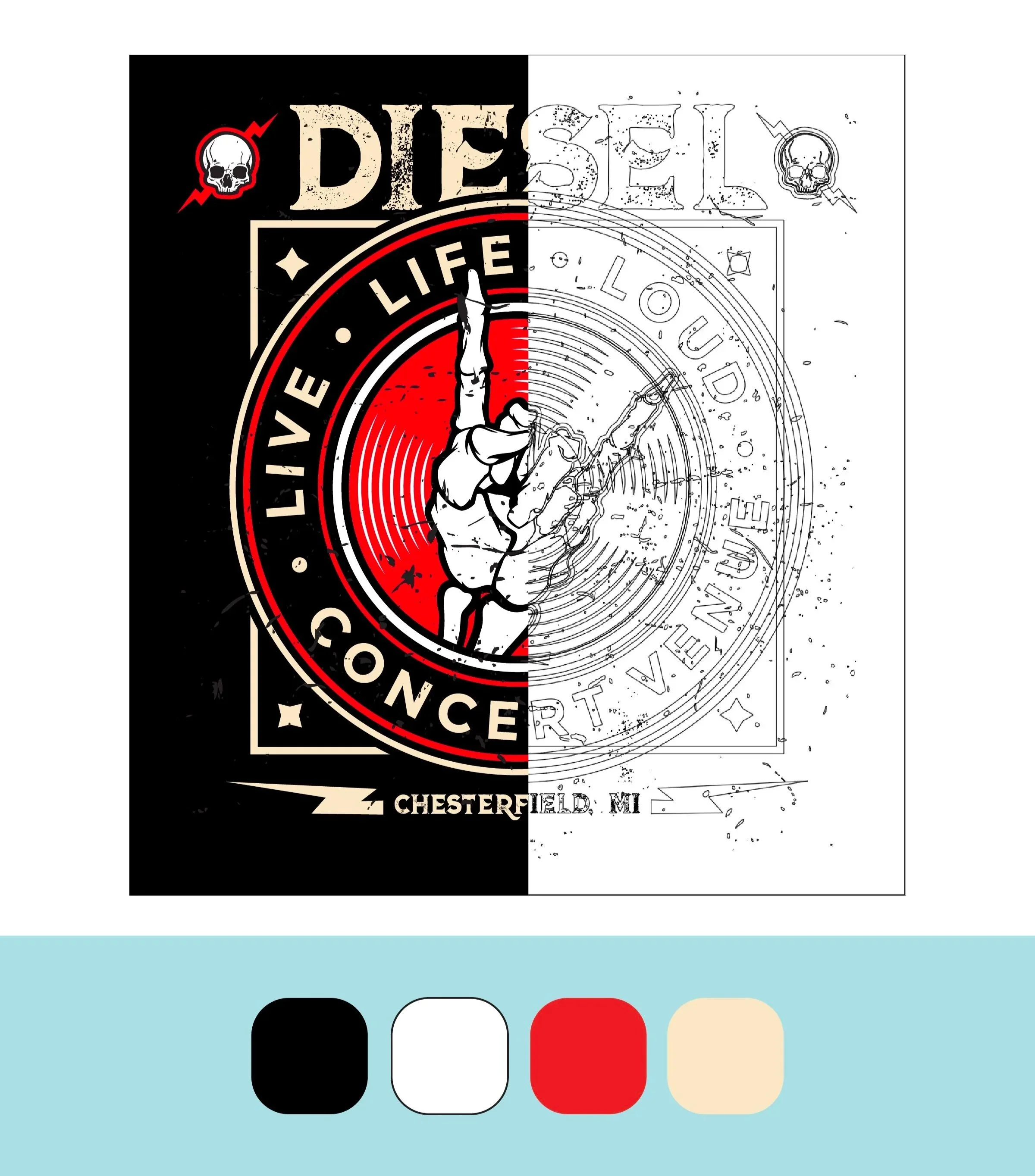
Under the Hood — Vector Construction
Every apparel graphic I build is constructed as vector art in Adobe Illustrator. That's a production requirement, not a preference. Screen printing demands clean, scalable line work with clearly defined color areas. There's no room for gradients, blending modes, or effects that don't translate to ink on a screen.
The split view above shows what sits underneath the finished Diesel design. On the left, the completed graphic with all color fills, textures, and layering. On the right, the raw vector line art, every path, anchor point, and shape that makes the final image possible.
Building this way means thinking about the end result and the production process at the same time. Each element has to be isolated cleanly enough to separate into individual color layers, while still reading as a cohesive composition when everything stacks together. The color palette for this design uses four ink colors: black (the garment itself), white, red, and cream. Each one was chosen to maximize contrast and visual impact on a dark shirt while keeping the screen count manageable.
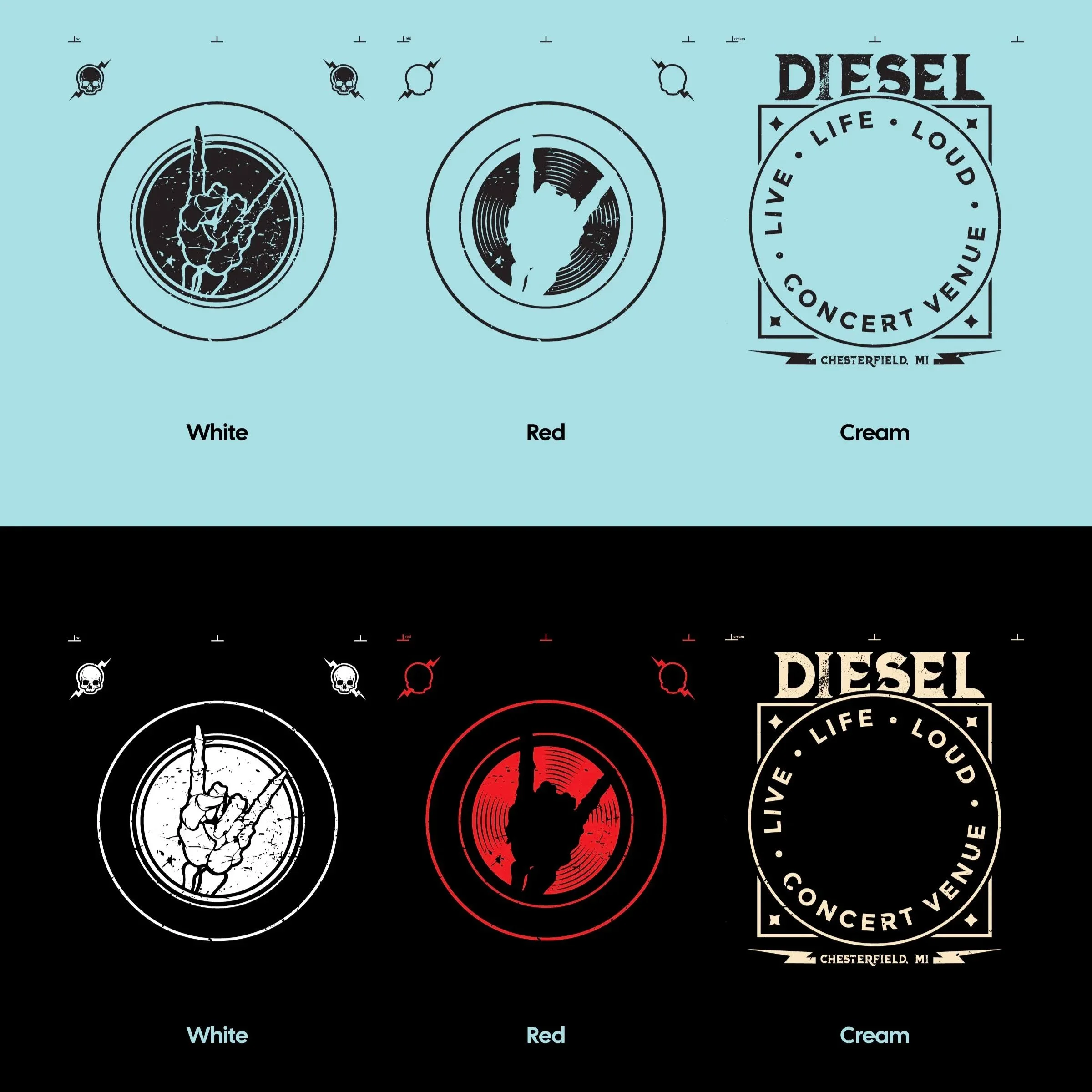
Color Separations — Designing for Production
This is where apparel design diverges from most other graphic work. In screen printing, every color in the design gets its own screen, its own layer of ink, and its own pass through the press. More colors means more screens, more setup time, and higher production costs. So the design has to be strategic about how many colors it uses and how each one contributes.
The separation view shown here isolates each ink color from the Diesel design: white carries the hand illustration and structural line work, red fills the record and accent elements, and cream handles all the typography and framing details. Showing them on both a light and dark background demonstrates how each layer reads independently and how they interact on different substrates.
This kind of thinking happens on every project, whether the design uses two colors or six. The question is always the same: how do I get the most visual depth out of the fewest possible screens? That's the puzzle I solve every day.
Designing Across Brand Voices
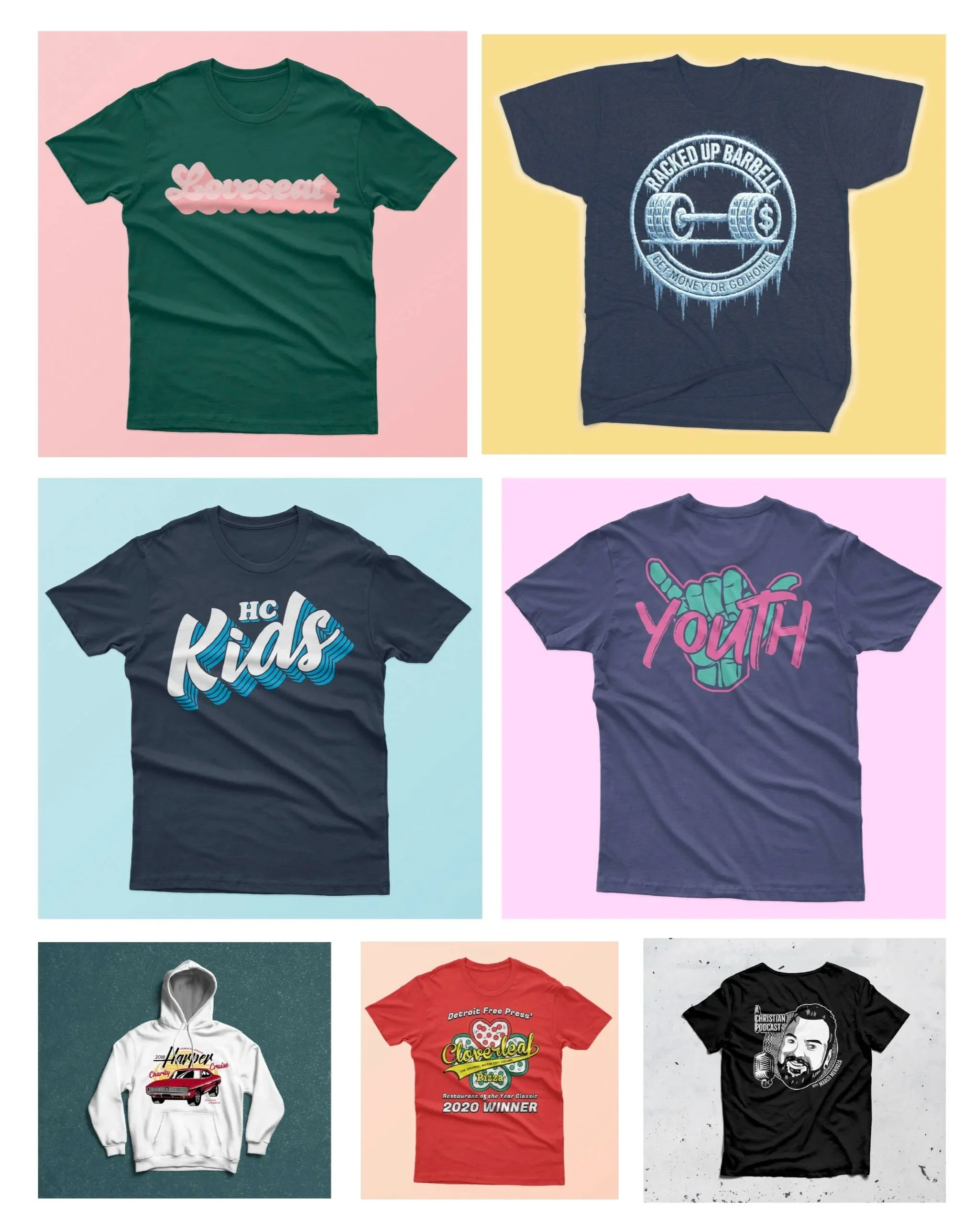
One of the things I enjoy most about apparel design is the range. On any given week, I might be designing a retro script logo for a furniture brand, a gritty barbell badge for a gym, a playful hand-lettered lockup for a children's ministry, and a portrait illustration for a podcast, all in the same few days.
Each of those projects demands a different visual language. The Loveseat design leans into soft, bubbly, retro typography. The Racked Up Barbell graphic needs weight and edge. HC Kids calls for energy and approachability. A podcast tee needs personality and likeness. The garment color, ink count, audience, and brand personality all shift from project to project, and the design decisions shift with them.
This is where production experience becomes a creative advantage. When you understand how ink sits on cotton, how a design reads from ten feet away, and how a three-color limitation actually forces stronger compositions, you start designing with the press in mind from the first sketch. The constraints become part of the creative process, and the work is stronger for it.
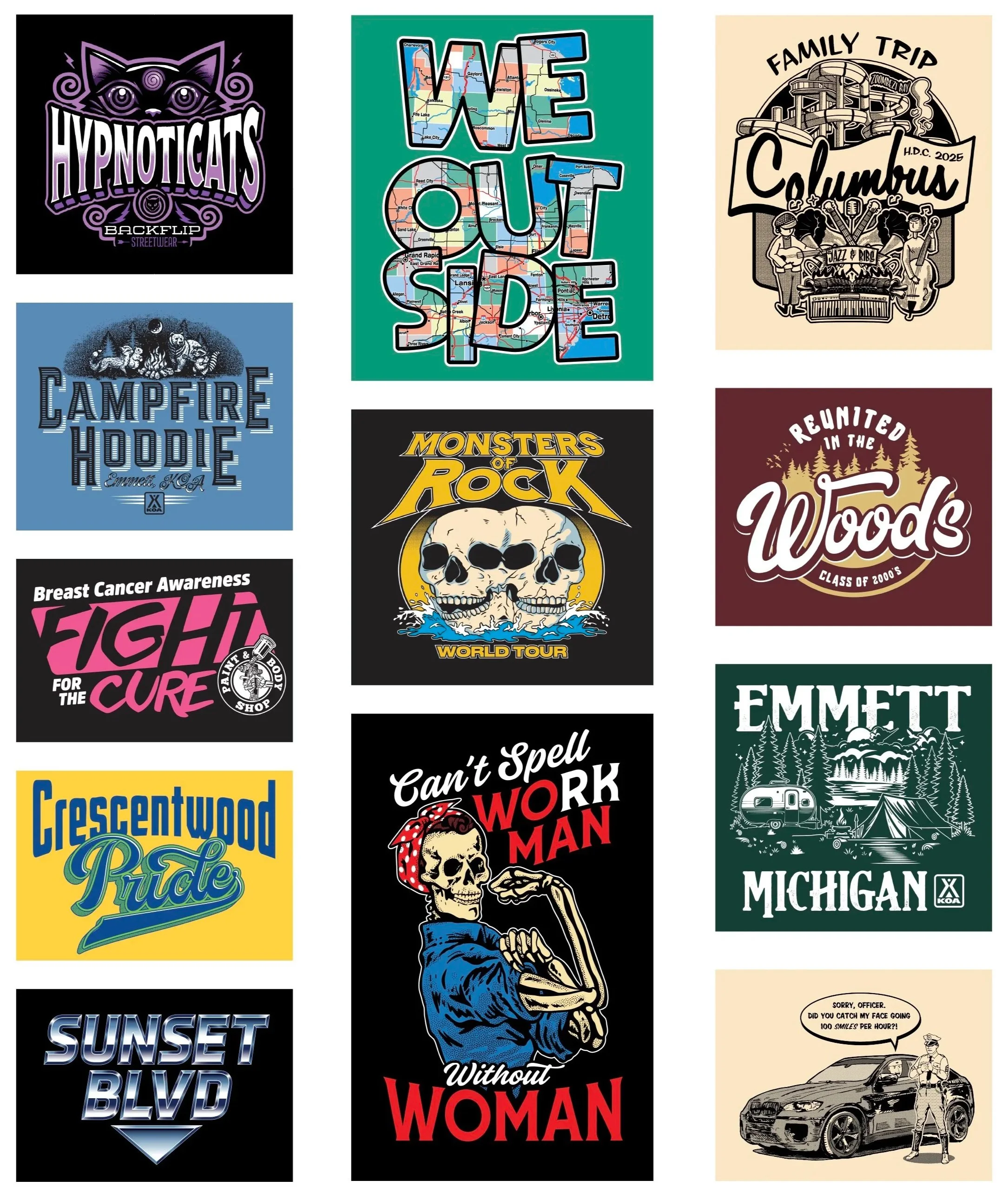
The Full Range
The samples shown here represent the broader scope of what I design at J's Silkscreens. Streetwear graphics, outdoor and camping brands, concert and music merch, family reunion tees, sports leagues, charity events, community pride, humor, and everything in between. Each one started as a conversation with a client and became a finished, print-ready graphic built for production.
What ties all of this work together is the approach. Every design goes through the same process: understand the client's brand and audience, develop a concept that communicates clearly on a garment, build it as clean vector art, and prepare it for separation and print. The style changes. The thinking stays consistent.
Reflection
Apparel design has taught me more about visual communication than almost anything else. When your canvas is a t-shirt and your viewer is standing across a room, every element has to earn its place. There's no room for filler. The message has to land fast, and the craft has to hold up under real-world conditions.
This work has also shaped how I think about design in general. Working within tight production constraints, limited color counts, specific substrate requirements, and fast turnarounds, has made me a sharper, more intentional designer across every medium I work in. The discipline it takes to design for the press carries over into everything.
Role: Graphic Designer, Illustrator
Studio: J's Silkscreens
Tools: Adobe Illustrator, Adobe Photoshop
Medium: Screen print apparel graphics
Categories: Apparel Design, Vector Illustration, Print Production