
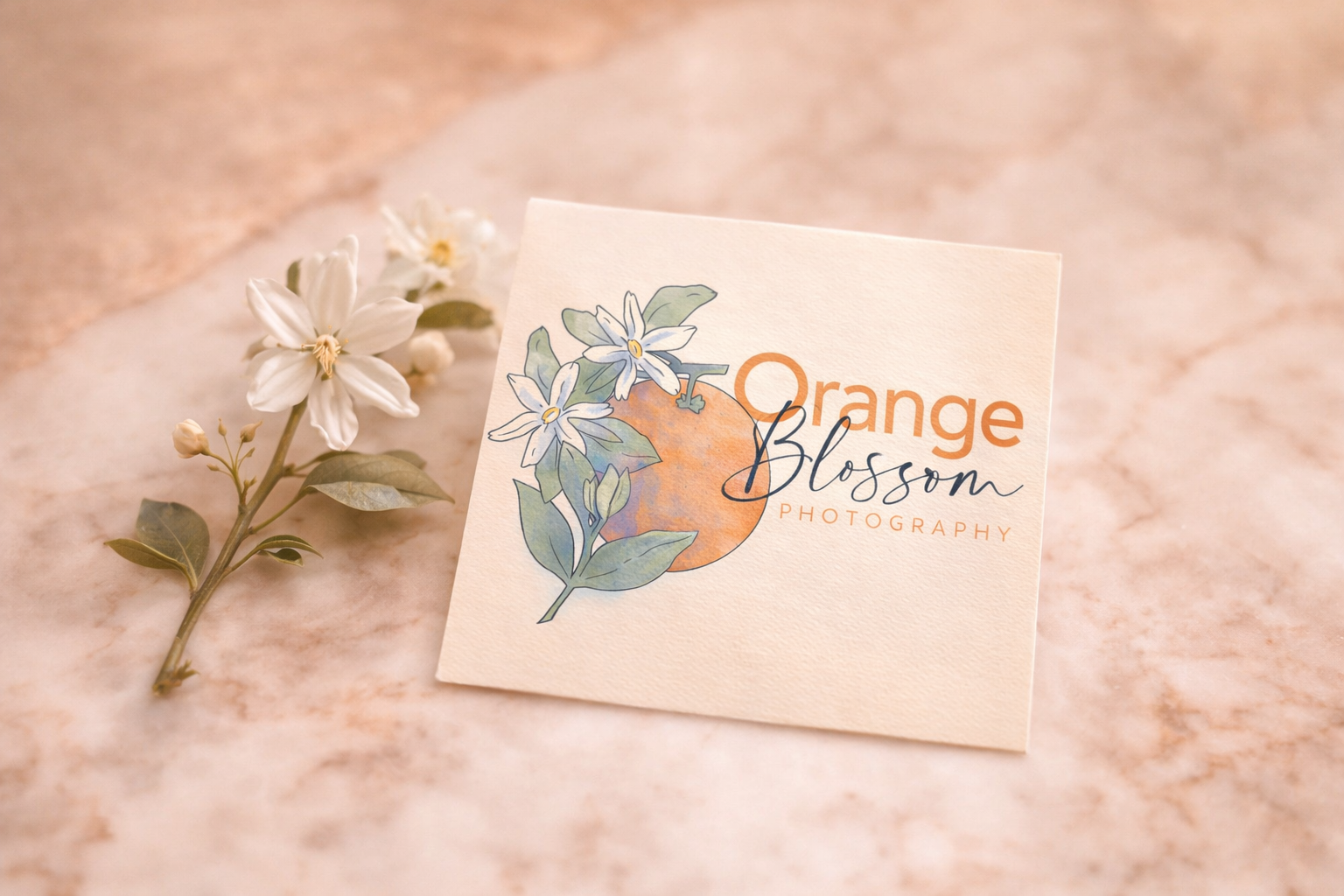
Orange Blossom Photography
Brand & Identity | Self-Initiated | Brand System | Illustrated Logo Mark
An illustrated brand mark built through iteration, where the final composition came from learning what the work was actually trying to say.


The Setup
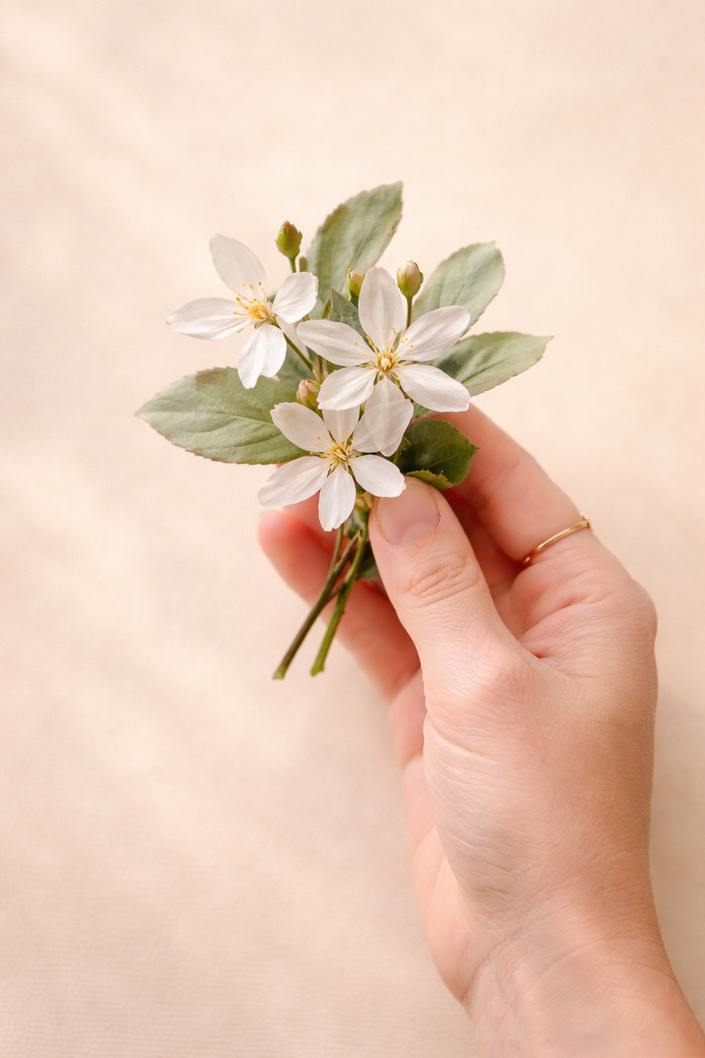
Orange Blossom Photography is a real wedding photographer based in the Midwest. I used her business as the prompt for a self-directed illustration study, exploring how a single mark could carry the softness of wedding work while still feeling structured enough to function as a brand.
The goal was to build something that felt hand-touched. Watercolor, botanical, quiet. Photography branding tends to lean either minimal and typographic or overly ornate. I wanted to find a middle space that felt warm without feeling precious.
First Direction
I started where a lot of designers start, with the obvious move. A camera shape, a citrus shape, a flower. Literal, clean, and stackable.

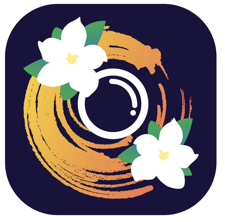
This direction was technically solid. The shapes worked, the color was loud, the silhouette read clearly at small sizes. It also felt like every other photography logo in the wedding space. Loud where the brand needed to be quiet.
I kept building it out anyway, because sometimes you have to finish a wrong direction to understand why it's wrong.
The Pivot
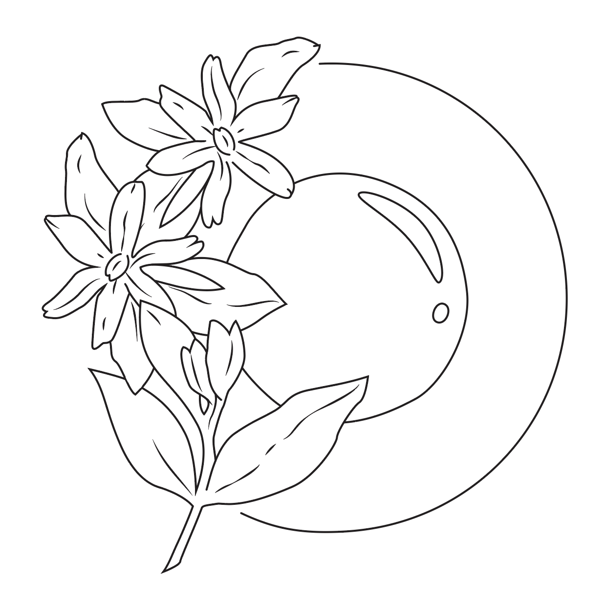
The shift happened when I stopped designing a logo and started drawing.
I went back to the sketchbook, drew the orange blossoms from reference, and let the composition come from the illustration instead of forcing the illustration into a logo grid. The lens became a quiet anchor in the back of the composition rather than the loudest element on the page.
This is the lesson I keep relearning. When a project feels stuck, the answer is usually further upstream than where you're working. I was solving a layout problem when the real problem was conceptual.
Building the Final Composition
From the line work, I moved into watercolor, testing how much texture the mark could hold without losing legibility. The progression below shows three of the directions I tested before landing on the final.
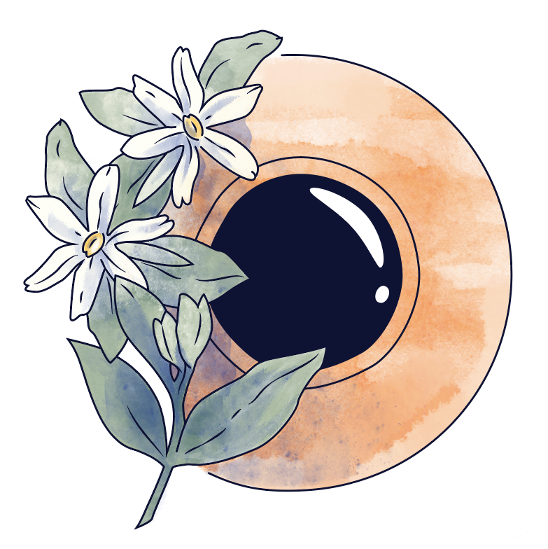
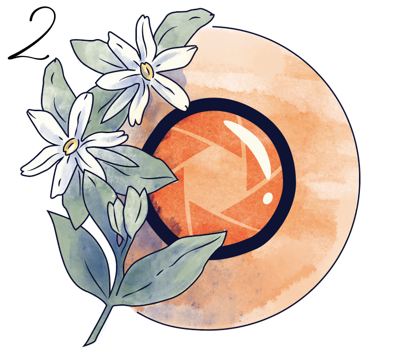

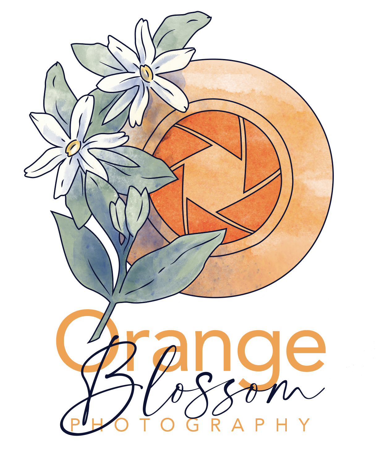
The direction with the camera lens still wasn’t working. It wasn’t communicating the orange or the camera lens clearly. So I make a few changes to complete the shape of the orange, and remove the camera lens altogether.
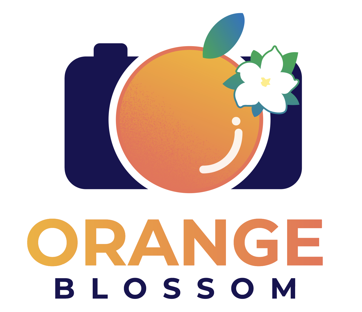
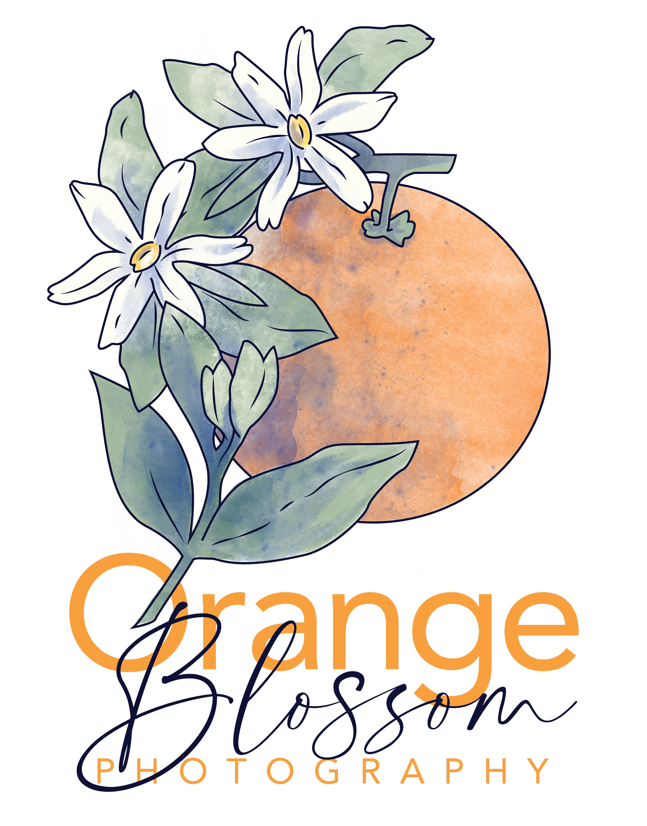
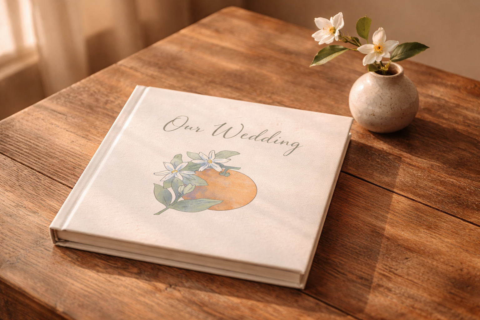
The final mark uses a soft watercolor orange as the anchor, with the orange blossoms layered in front and a subtle camera lens form sitting behind. The typography pairs a geometric uppercase with a script for Blossom, giving the mark a wedding-industry warmth without leaning into cliché.
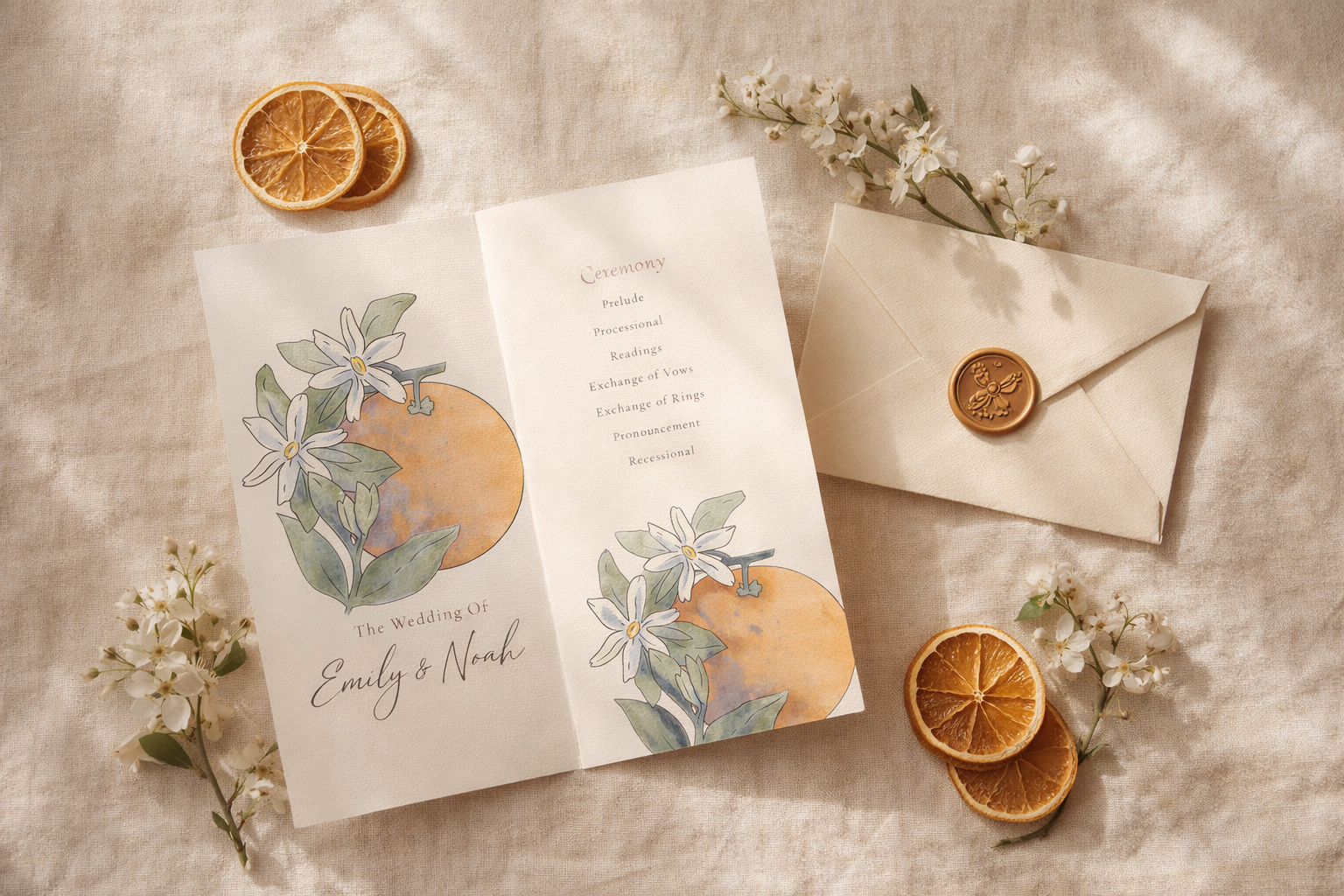
The System
A logo is a starting point. For the mark to actually function as a brand, it needed to flex across contexts: light backgrounds, dark backgrounds, horizontal layouts where vertical wouldn't fit, and reduced forms for small applications like favicons or watermarks on photos.
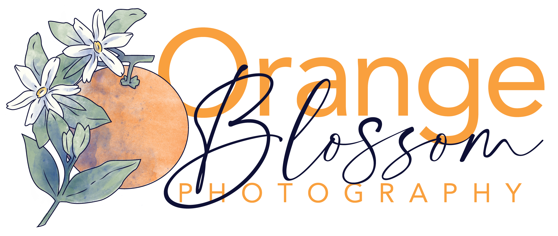
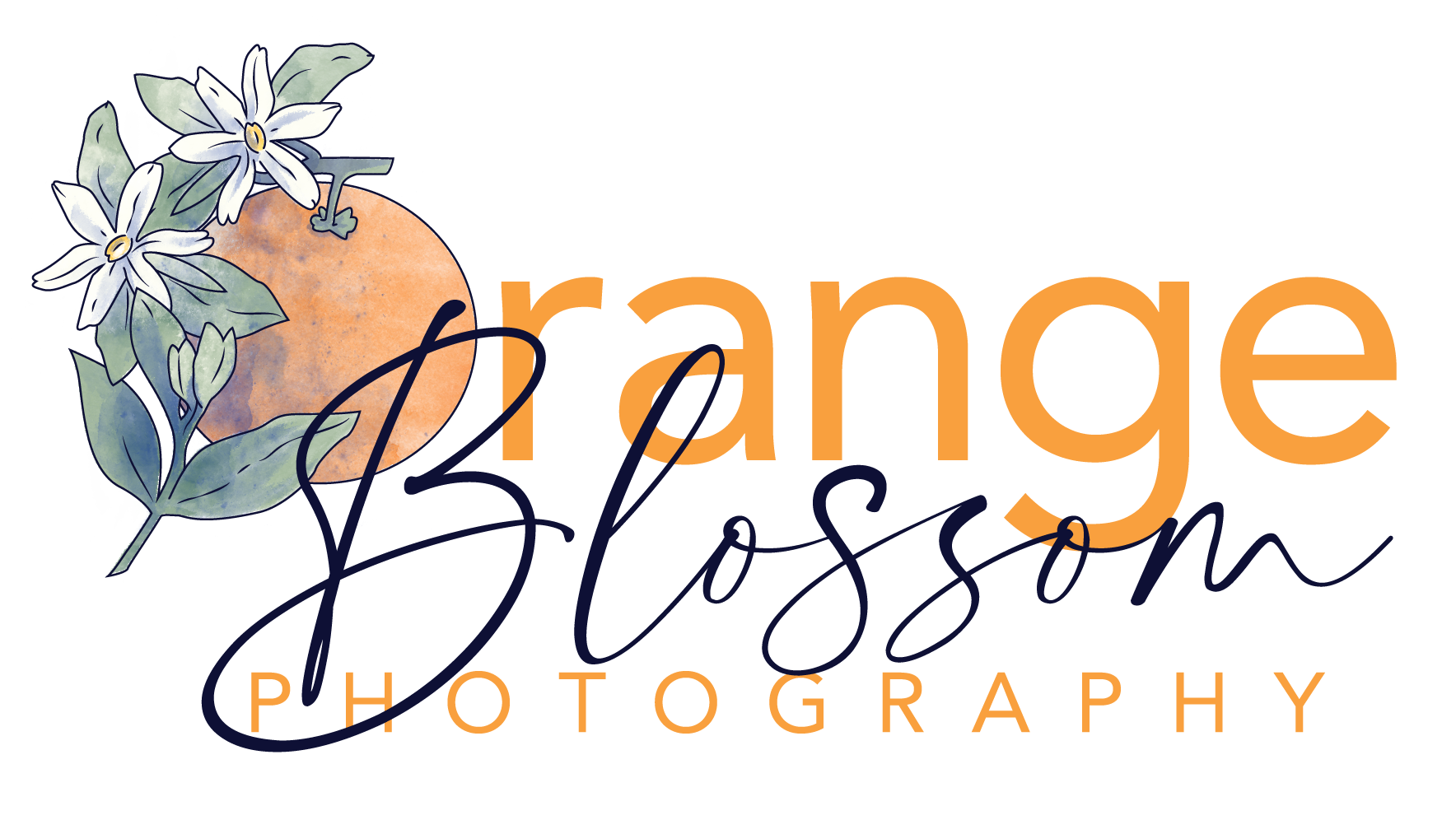
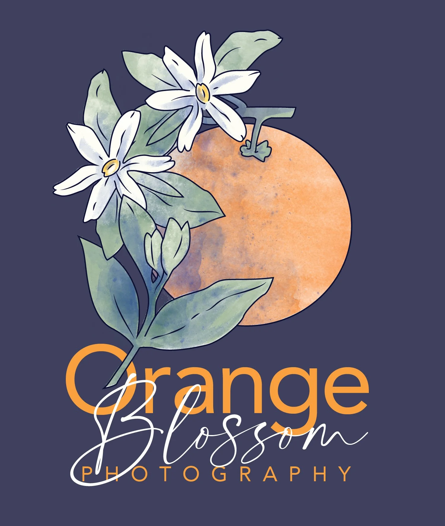
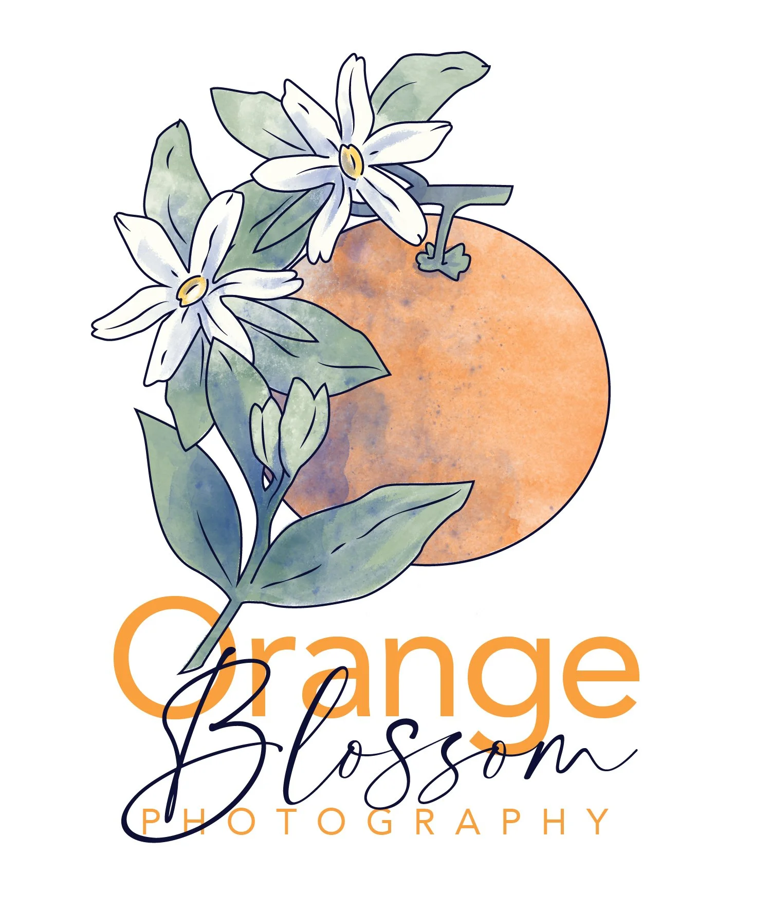
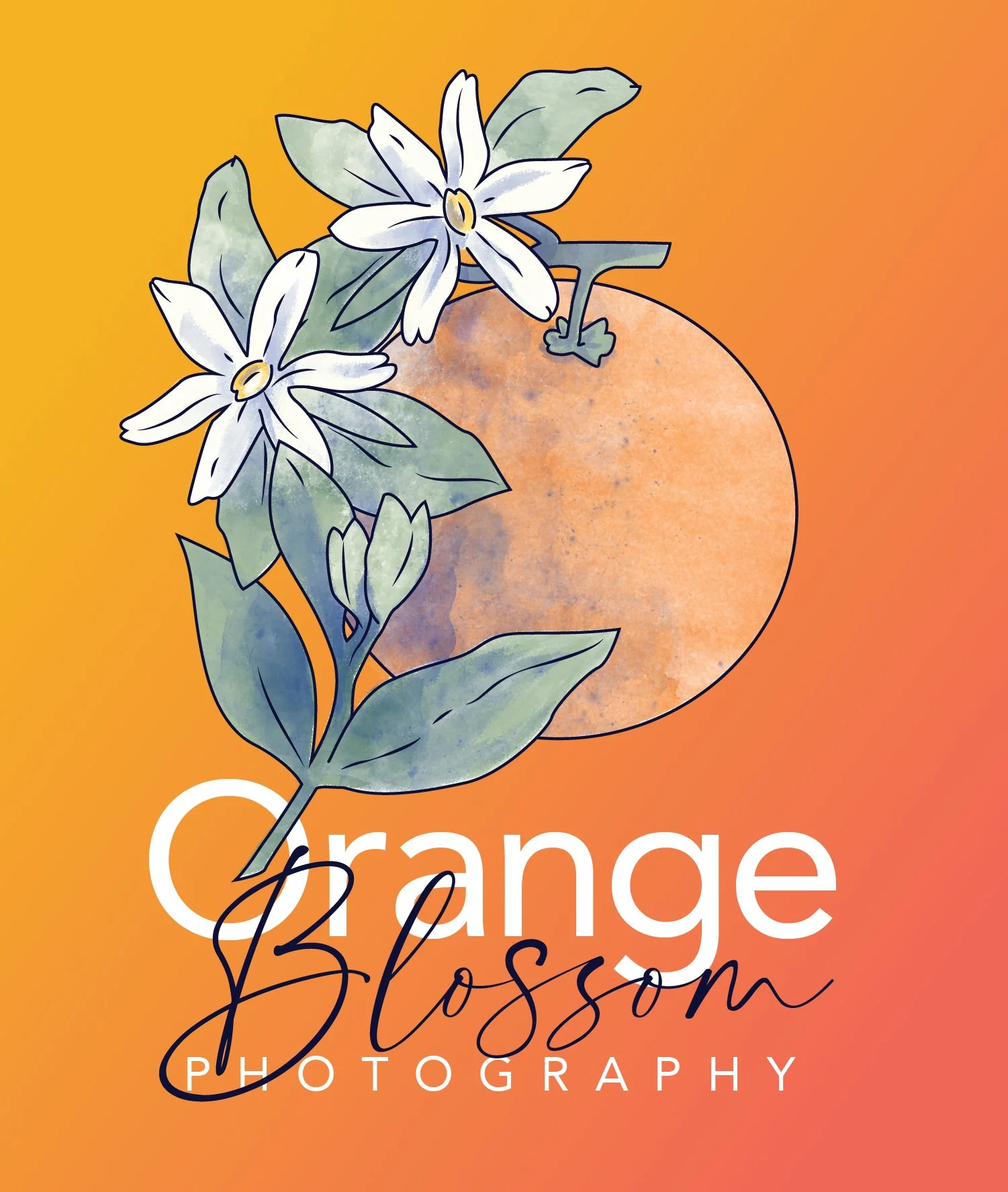
I built out a usage system with a primary vertical lockup, a horizontal alternate, a word-mark for type-only contexts, and an illustration sub-mark for moments where the brand needed to feel quiet.
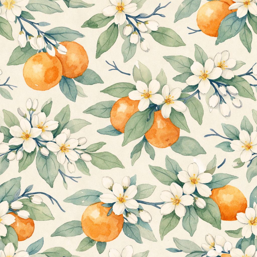
The color way tests confirmed the mark held up across the full brand palette. The watercolor textures behaved well on white, on navy, and across warm gradient backgrounds, which gave the brand room to breathe across print, web, and social applications.

What I'd Carry Forward
Three things from this project that shaped how I work now.
The first idea is rarely the right one, but it's almost always necessary. You have to build the obvious version to see past it.
Illustration-first branding requires a different kind of restraint. Every added element costs you legibility, so you earn complexity by removing things first.
Photography brands in the wedding space are crowded. The way to stand out is rarely louder. It's usually quieter and more specific.