
Press & Pull
Poster Design | Illustration | Social Media Campaign
A poster and social media campaign concept for a screen printing workshop, built around the energy, texture, and hands-on spirit of the print process itself.
The Concept
"Press & Pull" is the motion at the center of screen printing. You press the screen down, pull the squeegee across, and something that didn't exist a second ago is suddenly right there on fabric or paper. It's physical, immediate, and a little unpredictable. That tension between control and surprise is what makes the craft compelling, and it's what I wanted the campaign to feel like.
The project is a poster and social media campaign concept for a screen printing workshop. I set it at J's Silkscreens, the shop where I work every day, because I wanted the campaign to feel grounded in a real place and a real process. The goal was to capture the culture of print, not just promote an event. The kind of energy you feel in a shop when the ink is wet and the press is running. Bold, analog, a little rough around the edges, and proud of it.
Research & Direction
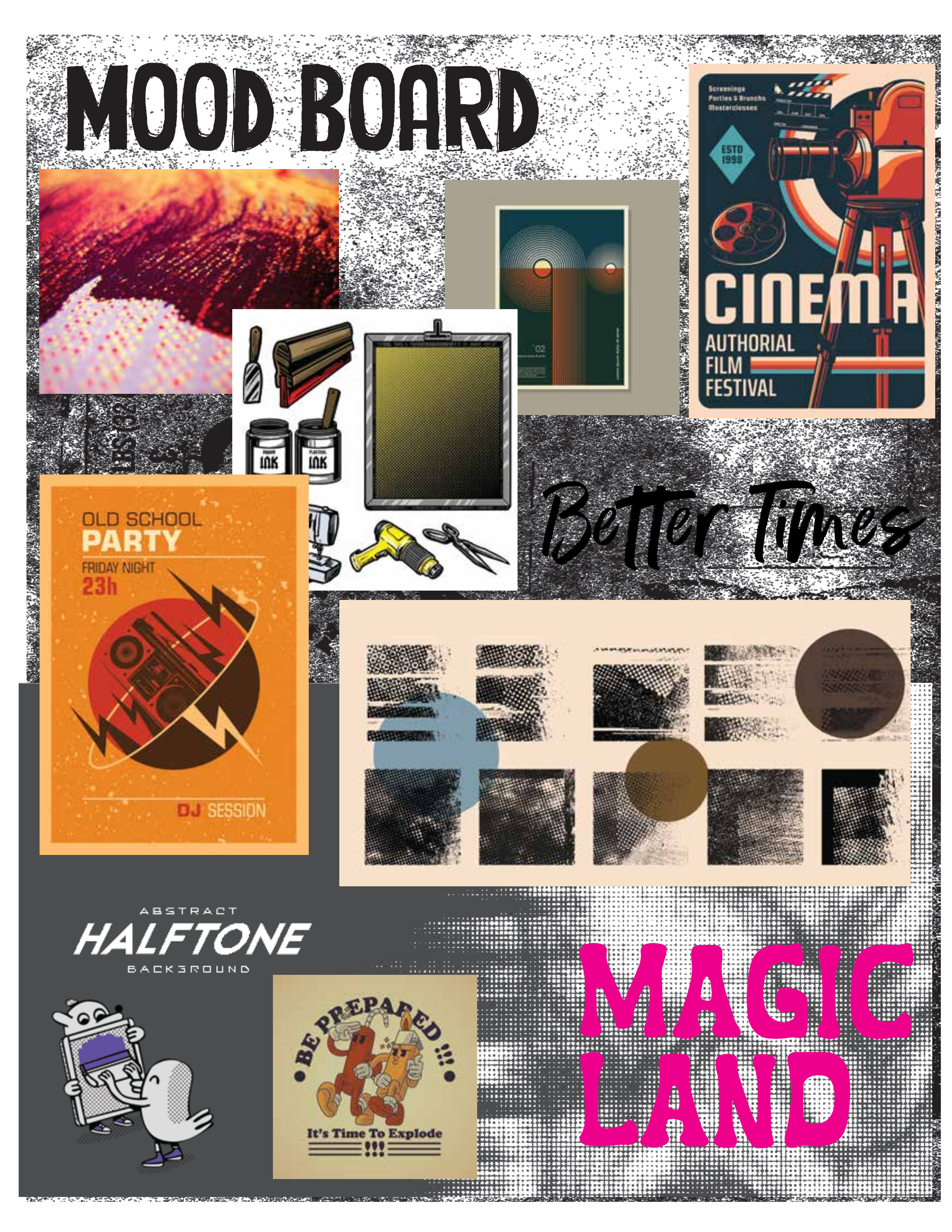
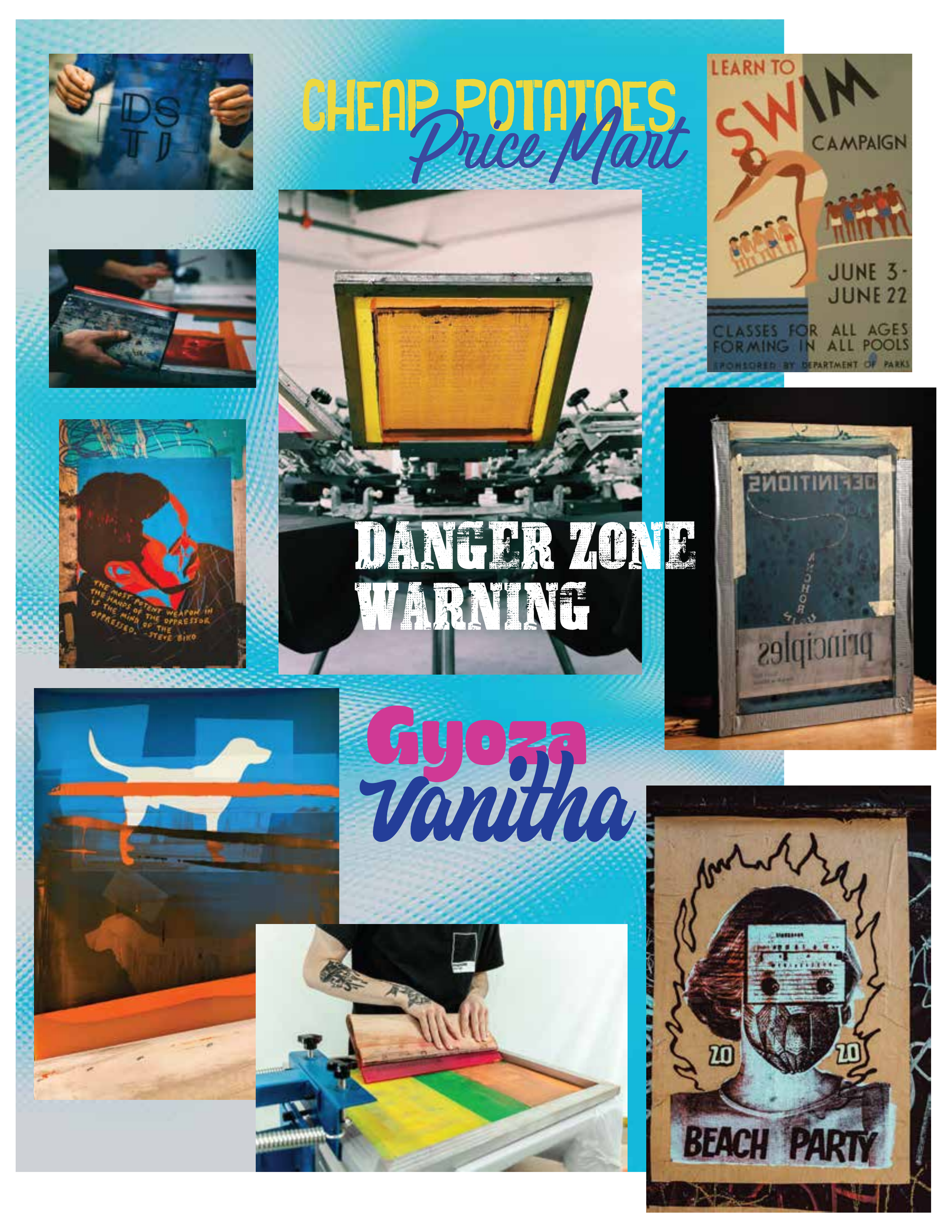
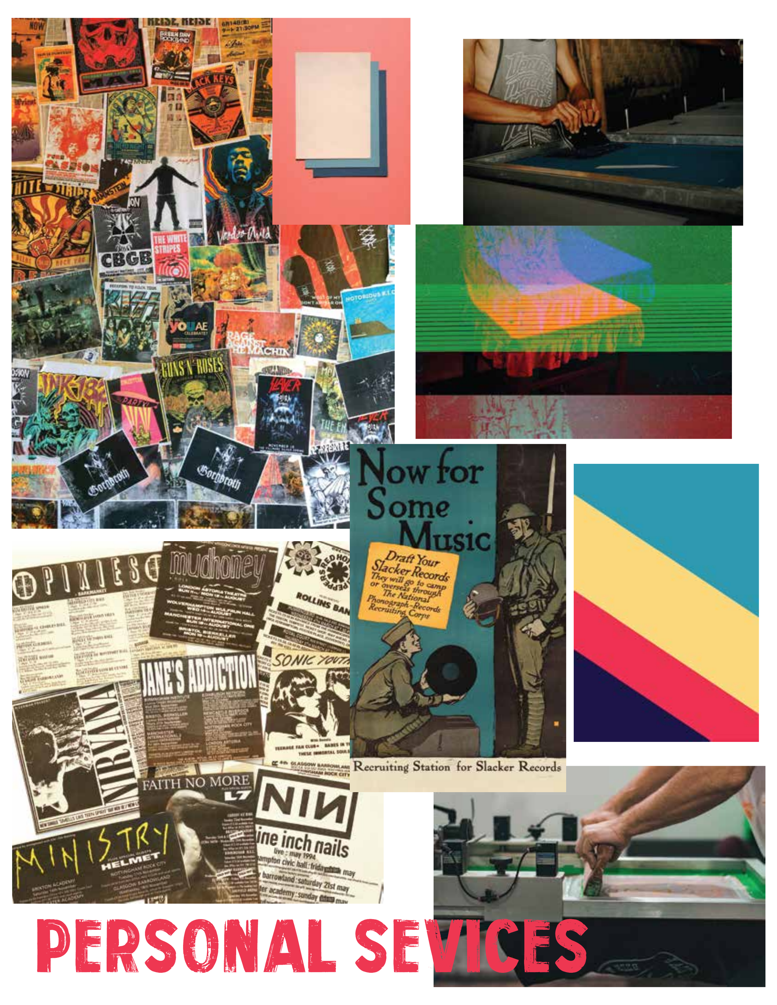
I started with a deep dive into the visual world I wanted the campaign to live in. Vintage gig posters, zine culture, risograph printing, punk flyers, and the work of artists like Kevin Tong, Invisible Creature, and DKNG. All of it shares a common thread: tactile, layered, and unapologetically handmade.
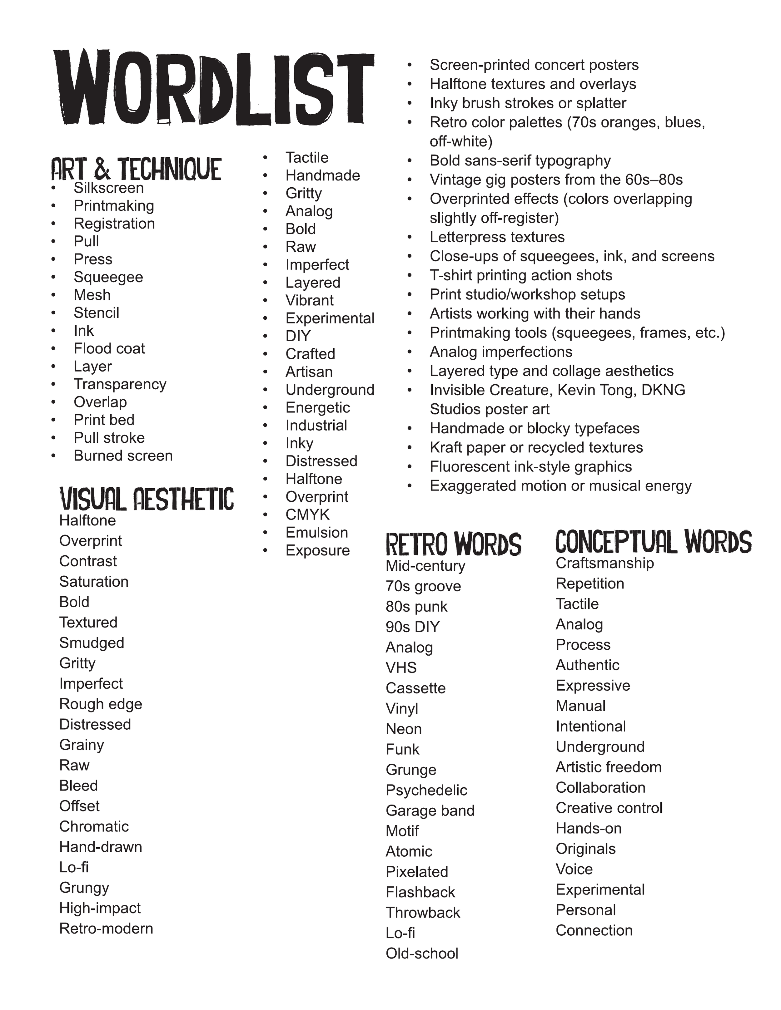
From there I built out a word list and mood board that mapped the territory. Words like "gritty," "analog," "layered," "imperfect," and "crafted" kept coming up. The visual direction leaned into halftone textures, ink splatters, overprinted color blocks, and bold sans-serif type that looks like it was pulled off a screen, not rendered on a computer.
The color palette landed on a retro-inspired combination of coral red, teal, navy, cream, and pink. Warm enough to feel inviting, punchy enough to stop someone mid-scroll.
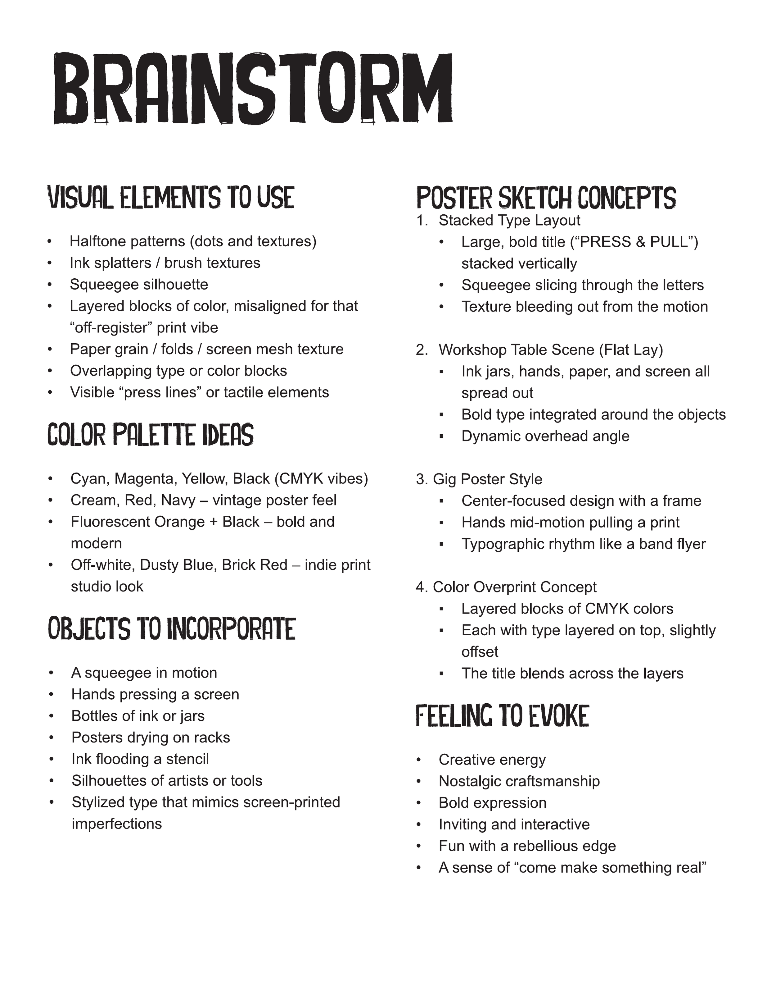
Finding the Composition
I sketched twenty thumbnail concepts before narrowing anything down. The early ideas explored a range of approaches: stacked typographic layouts, overhead workshop table scenes, gig-poster framing, and overprint color experiments. A few leaned into character illustration with a mascot figure. Others were purely typographic.
From those twenty, I refined three poster directions and two social concepts into tighter sketches.
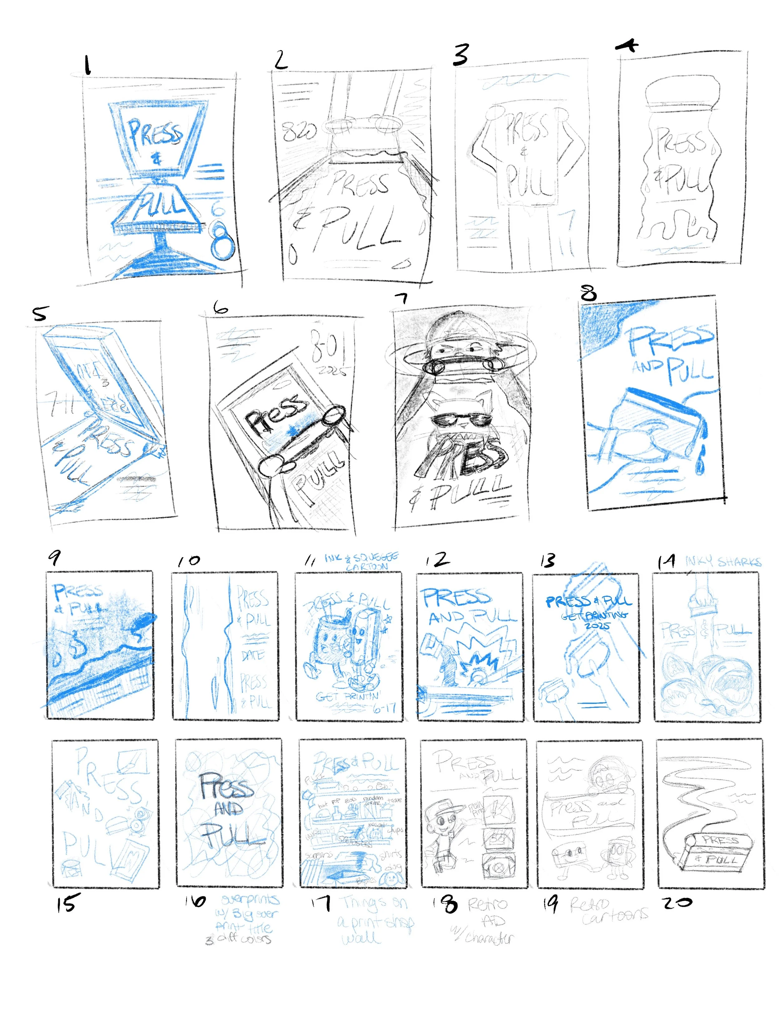
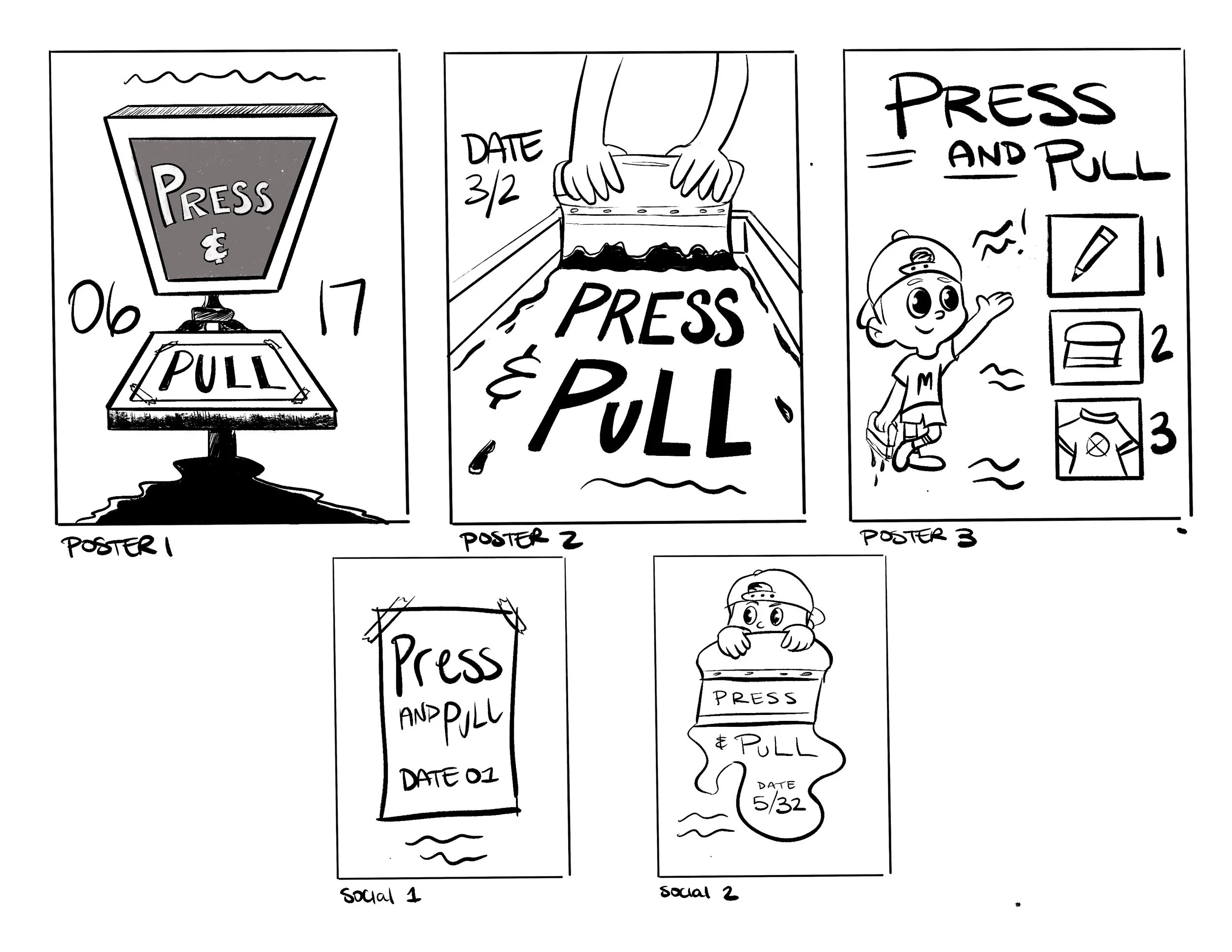
Poster 1 framed the press as a monumental object, the title split across the screen and platen with the event details anchored at the base.
Poster 2 went for a top-down perspective, a pair of hands mid-pull with the type integrated into the composition around the screen.
Poster 3 took a more playful, instructional route, with a character mascot walking the viewer through the workshop steps.
Considering some feedback, I decided that the strongest direction turned out to be one I hadn't refined yet. Concept 6 from the thumbnail round had something the others didn't: dynamic angles, bold contrast, and a layered composition that actually felt like the printing process in motion. I pivoted to that direction and built the final design from there.
Building the Poster
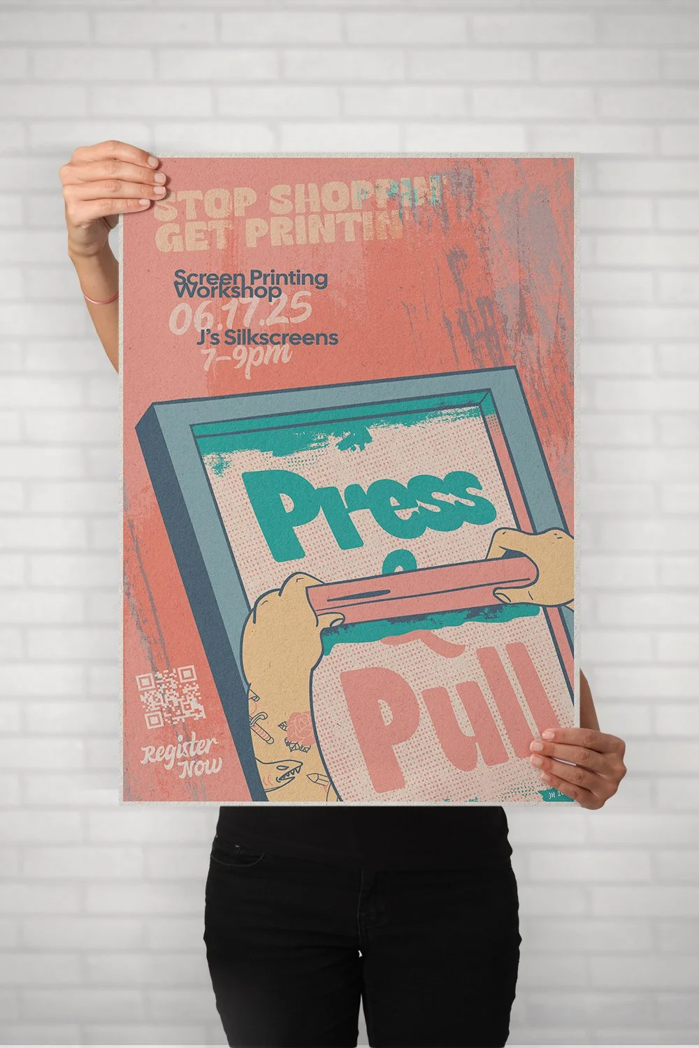
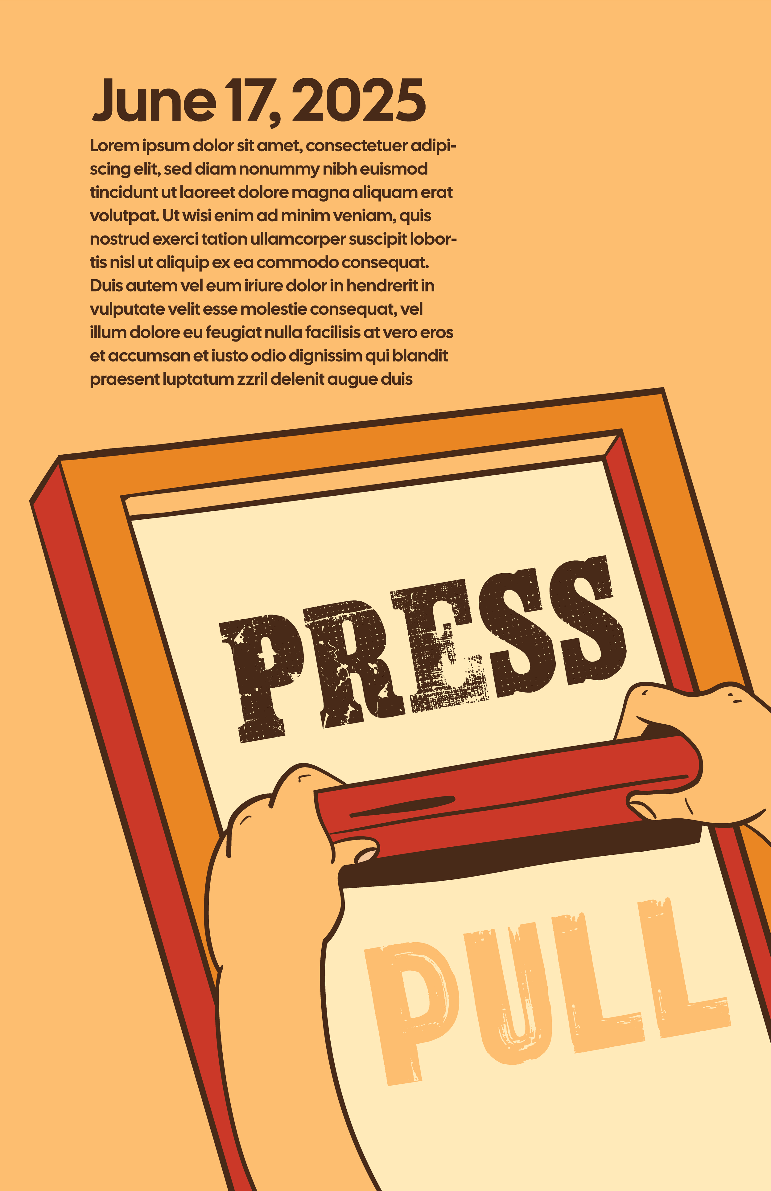
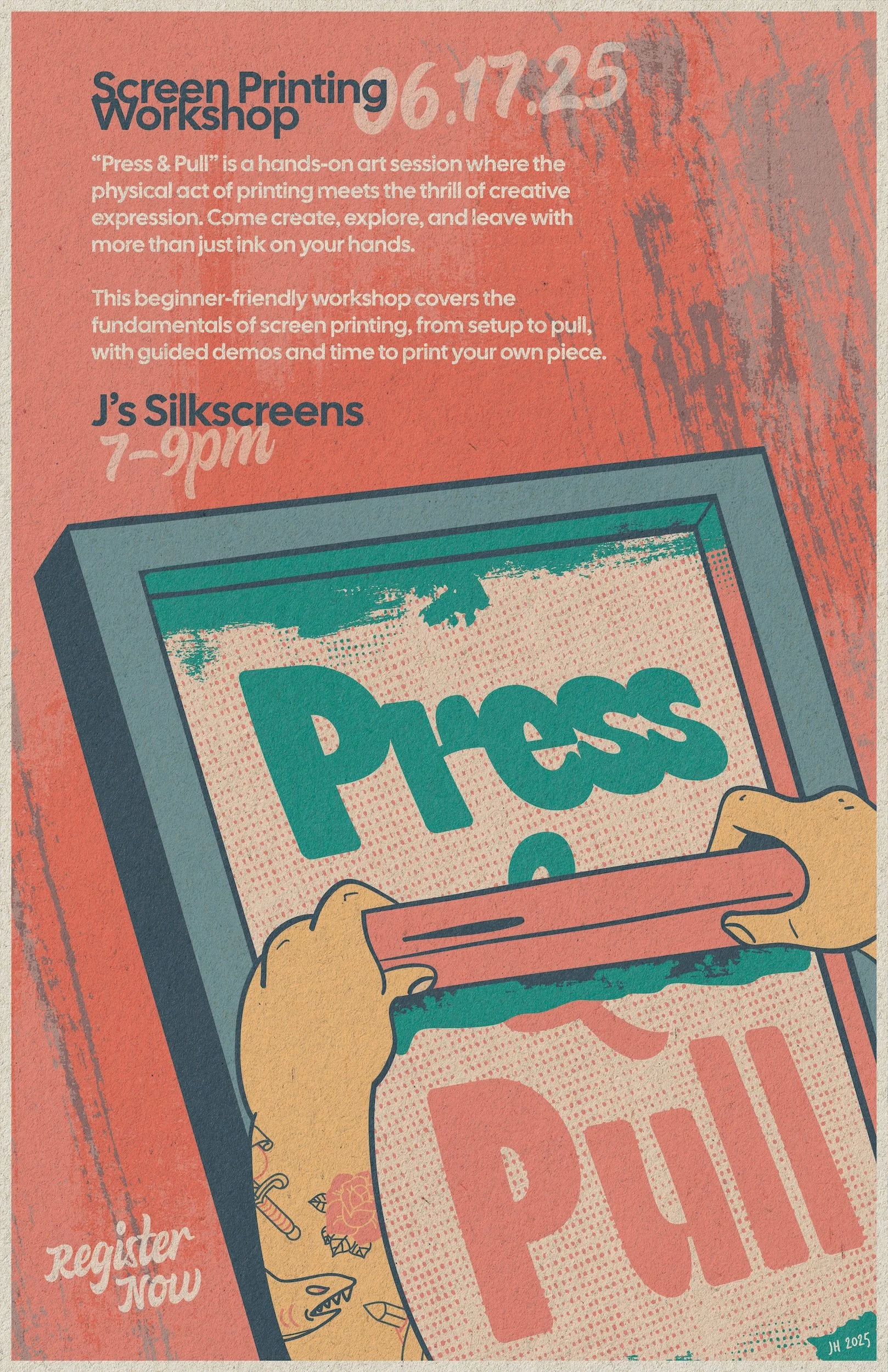
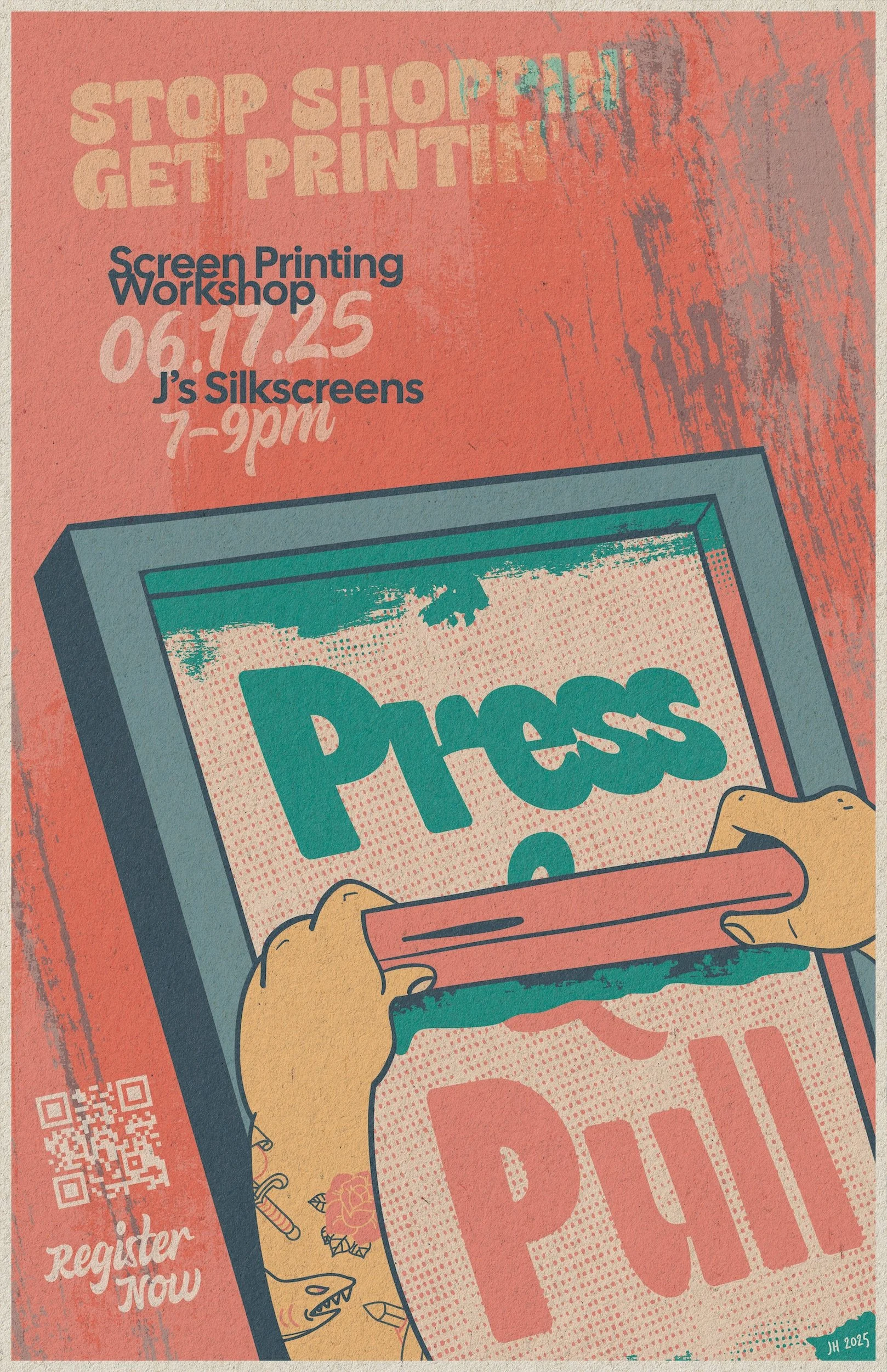
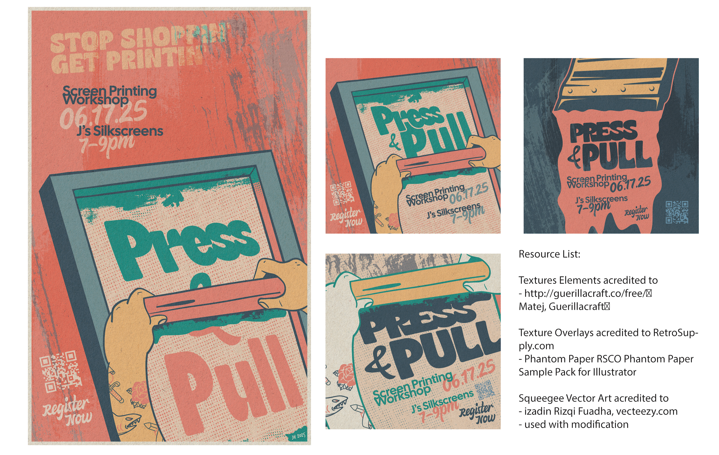
The final poster is built around a single illustrated moment: a pair of hands pulling a squeegee across a screen, mid-stroke. The composition is angled to create movement and energy, tilting the screen frame so the viewer's eye follows the pull from top to bottom.
The illustration style draws from vintage concert posters and screen print culture. The linework is bold and slightly imperfect, with ink splatter textures, halftone dot patterns, and layered color that intentionally looks a little off-register. That roughness is deliberate. A campaign about screen printing should feel like it came off a press, not out of a software preset.
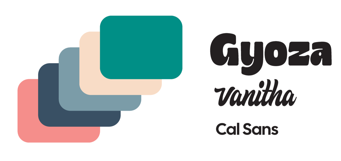
The typography uses Gyoza for the title treatment and Vanitha for supporting text, both chosen for their retro, hand-lettered quality. The tagline, "Stop Shoppin' Get Printin'," sits at the top in a distressed brush style that sets the tone before the viewer reads anything else. Event details (date, location, time) are stacked in the upper left using the same type system, keeping the hierarchy clear even with the angled composition.
The color palette works in layers. Coral red dominates the background and anchors the energy. Teal and green carry the screen frame and the "Press" title. Cream and gold handle the hands, squeegee, and accent elements. The layering creates depth and visual texture without adding complexity to the color count, a habit that comes from designing for actual screen production every day.
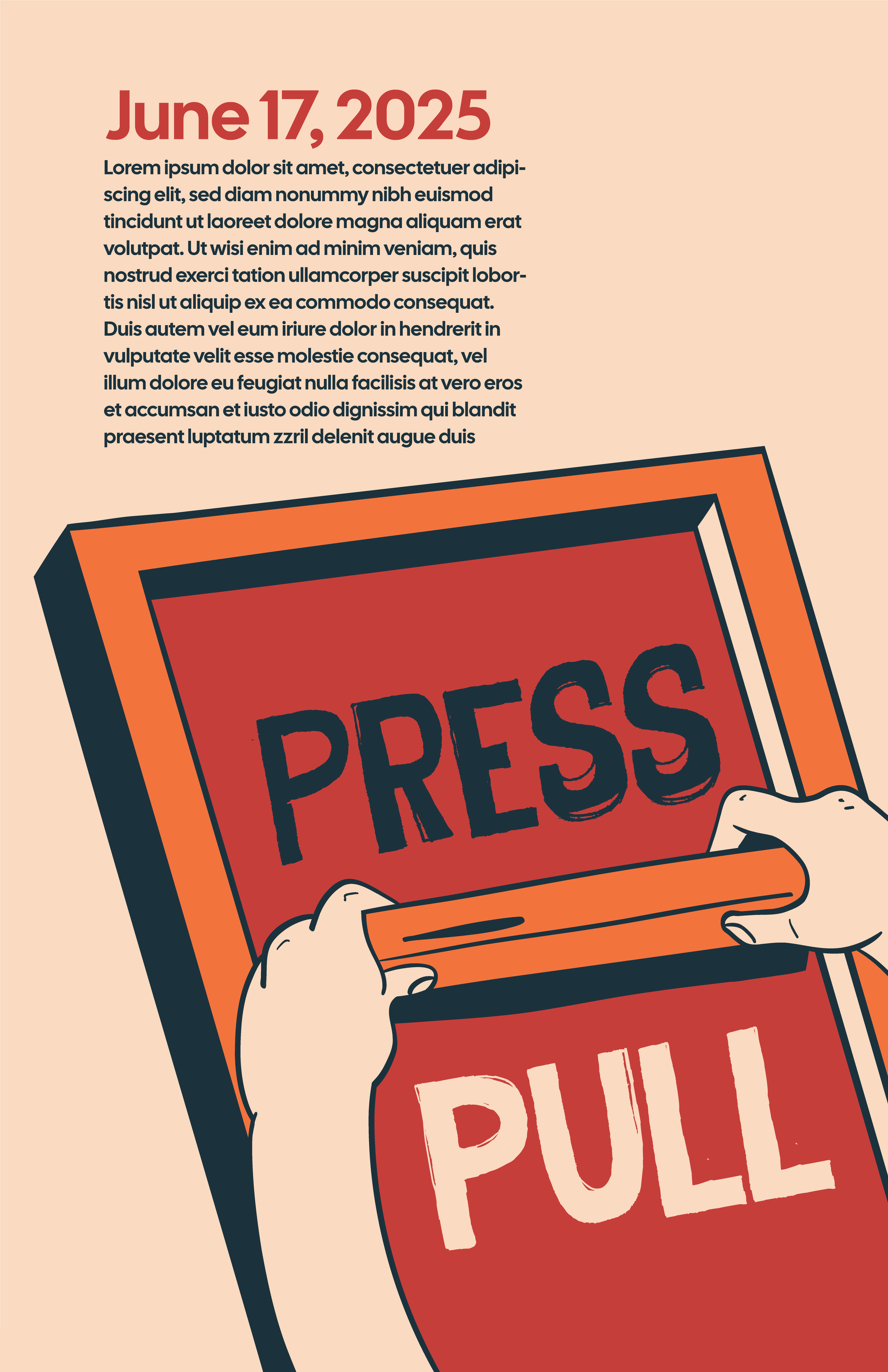
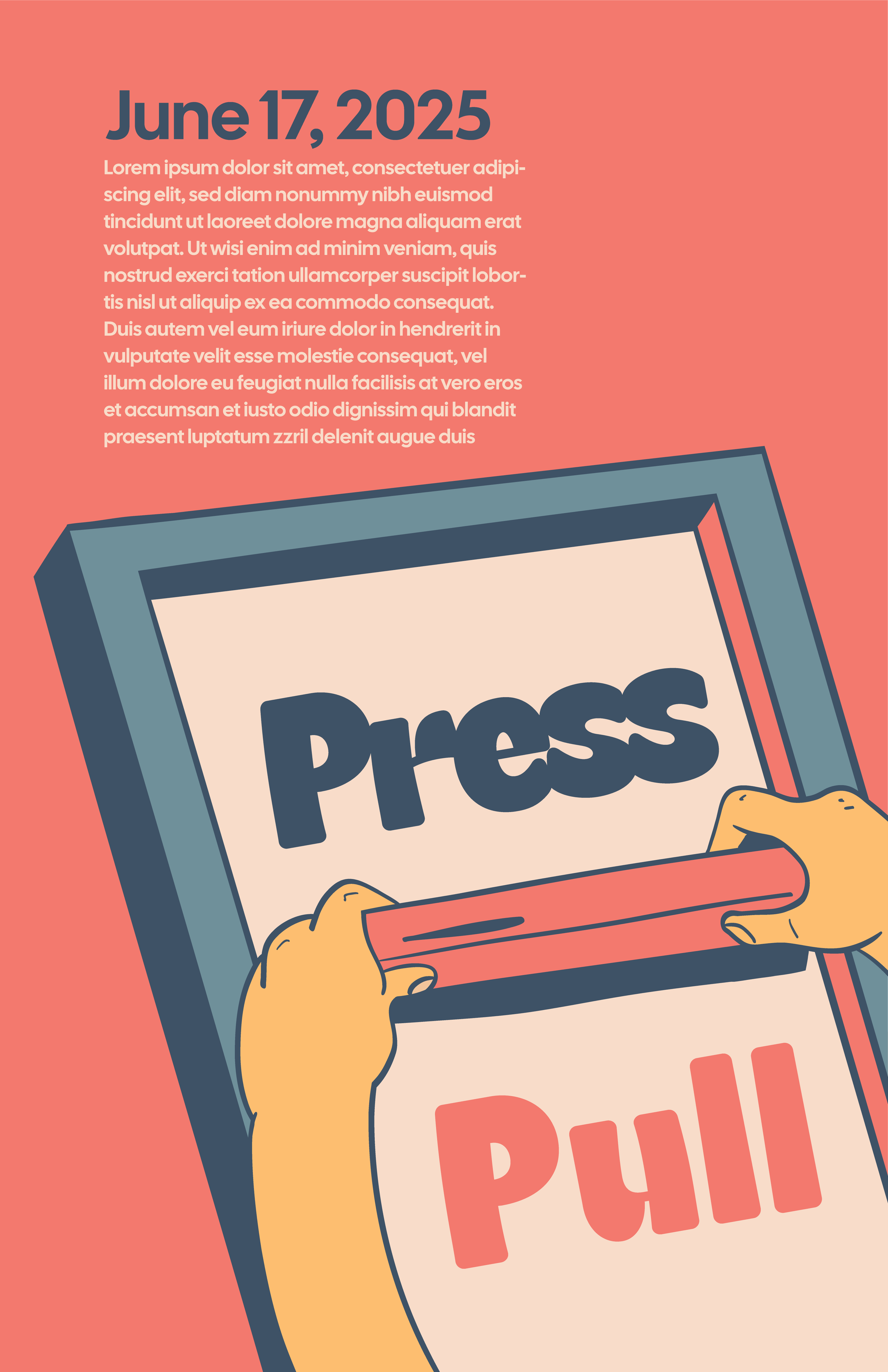
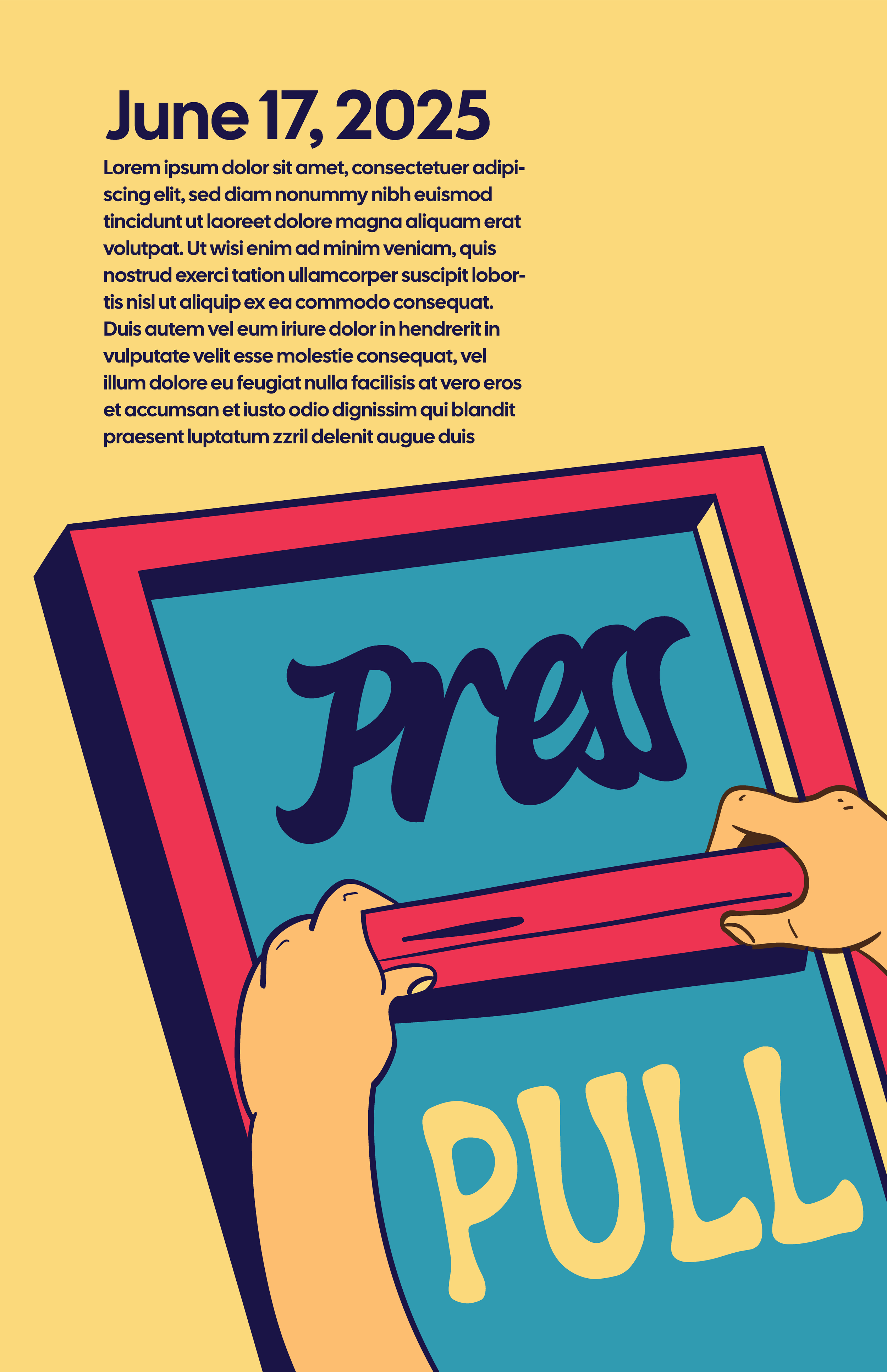
I went through four color and layout variations before locking the final version. Each round refined the balance between the illustration, typography, and background texture until the composition held together at both poster scale and thumbnail size.
This iteration felt a bit wordy with the text block at the top and was splitting the composition too much between illustration and text. I made a few last changes that felt more balanced that lead to the final design.
From Poster to Social
A poster is a single moment. A campaign needs to sustain attention across multiple touchpoints. The social media series takes the poster's visual language and breaks it into three distinct formats, each designed to work as a standalone piece while clearly belonging to the same family.
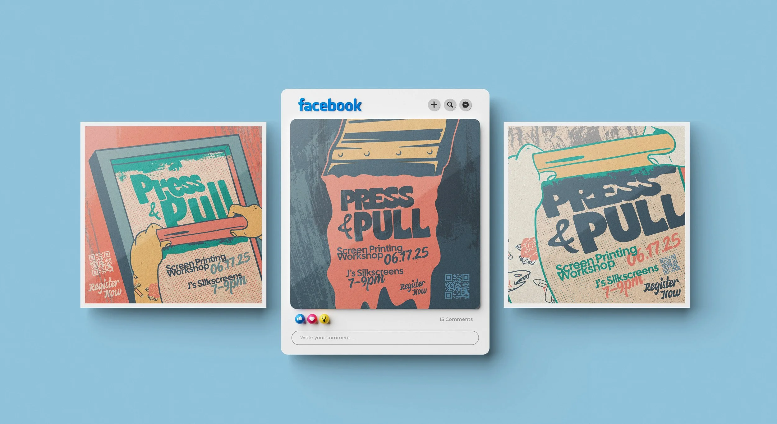
The poster crop pulls in tight on the central illustration, the hands, the squeegee, the screen. It keeps the full event details and works as a direct promotion piece. This is the most literal translation of the poster into a square format.
The typographic version strips the illustration back and leads with the squeegee pulling ink across the frame. The title sits inside the ink flow, making the type itself feel like it's being printed. This one is built for quick recognition in a feed, where the bold shapes and color contrast do the heavy lifting.
The detail crop zooms into the screen mesh texture, the halftone pattern, and the small illustrative details (the rose, the printed elements on the arms) that reward a closer look. This version is designed to create curiosity and draw the viewer into the craft behind the campaign.
All three share the same color palette, type system, and texture language. The event details appear consistently across every piece. The campaign reads as one voice across formats, which is the entire point.
Reflection
This project came together the way the best ones usually do: by following the work instead of forcing it. The concept I thought would be the final direction wasn't. The one that worked was sitting in my thumbnail sketches the whole time, waiting for me to stop overthinking and actually look at it.
Building a campaign concept around the shop where I work every day gave me something I don't always have on a project: real context. I know what the press sounds like, how the ink smells, what it feels like when a pull goes right. That familiarity shaped the design in ways that research alone couldn't. The textures, the off-register color, the slightly rough edges, all of it comes from watching the process happen in front of me, not from a mood board.
The biggest takeaway is one that keeps proving itself: a campaign isn't just a poster in different sizes. Each format has its own job. The poster stops you. The social posts pull you in. And if the visual language is strong enough, they all feel like the same conversation.
Role: Designer, Illustrator
Project Type: Self-Directed Concept
Tools: Adobe Illustrator, Adobe Photoshop
Category: Poster Design, Illustration, Social Media Campaign