Logo Design
CLIENT PROJECT | LOGO DESIGN | BRAND DESIGN
The Brief
Sweet As Honey Cookie Co. is a cottage bakery based in Southeast Michigan, built around custom sugar cookies, drop cookies, and cookie cakes made with real care. The baker behind it, Nina, had a business with a clear personality. She needed a logo that could finally match it.
The Concept
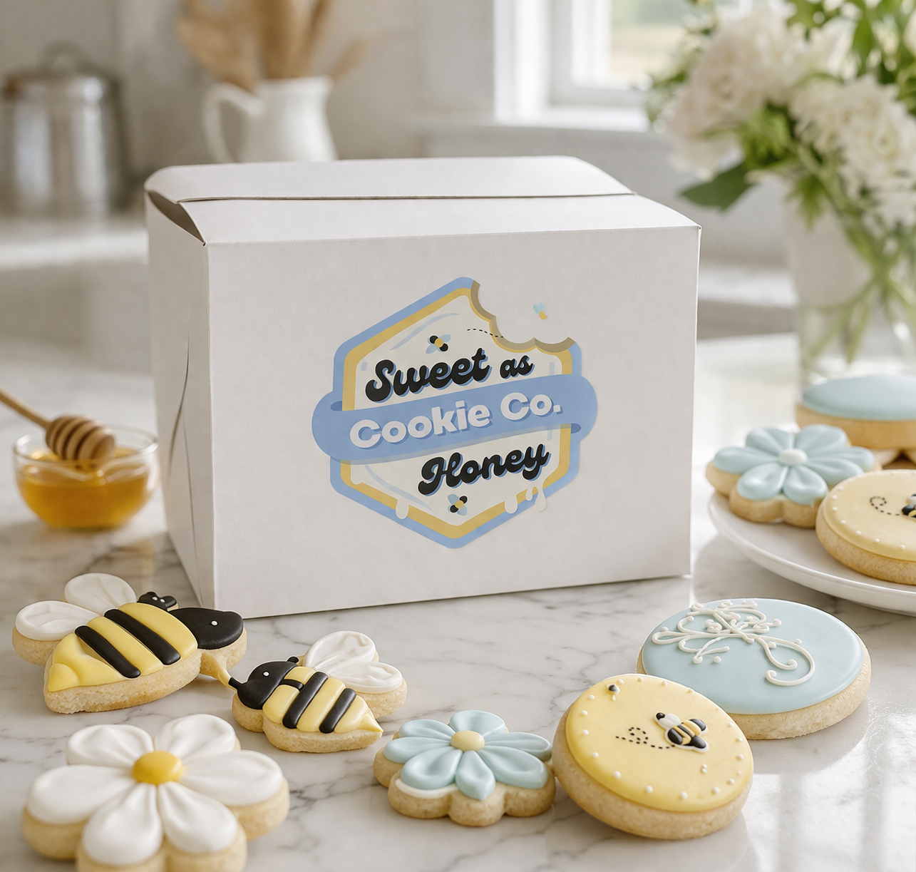
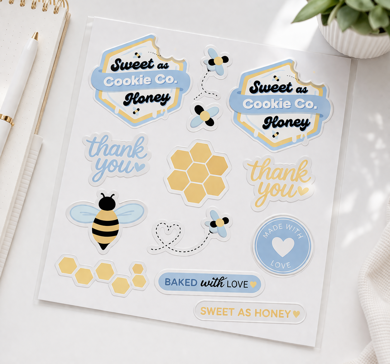
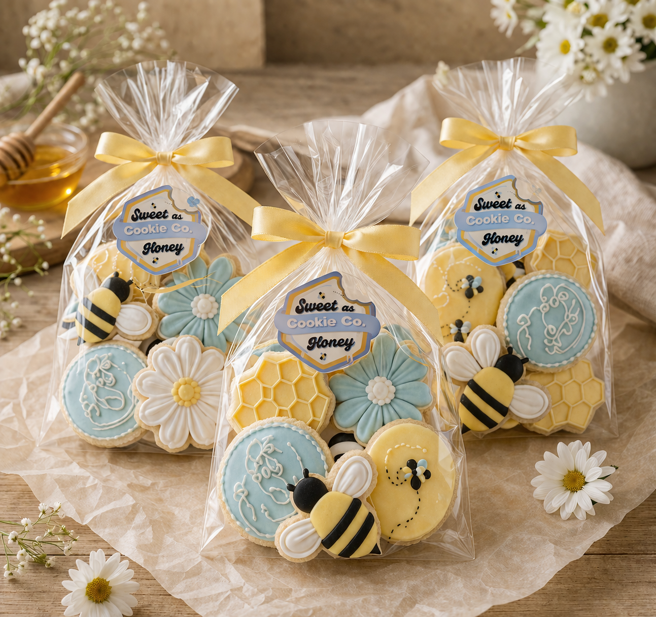
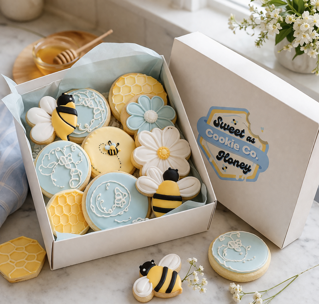
The name did a lot of the heavy lifting creatively. Sweet As Honey pointed directly to something visual: honey, cookies, warmth, and a little charm. The concept came together around a honeycomb-shaped cookie as the centerpiece, complete with oozing frosting that doubled as dripping honey. A pair of bees round out the mark, giving it life and keeping the playfulness grounded in the brand name itself.
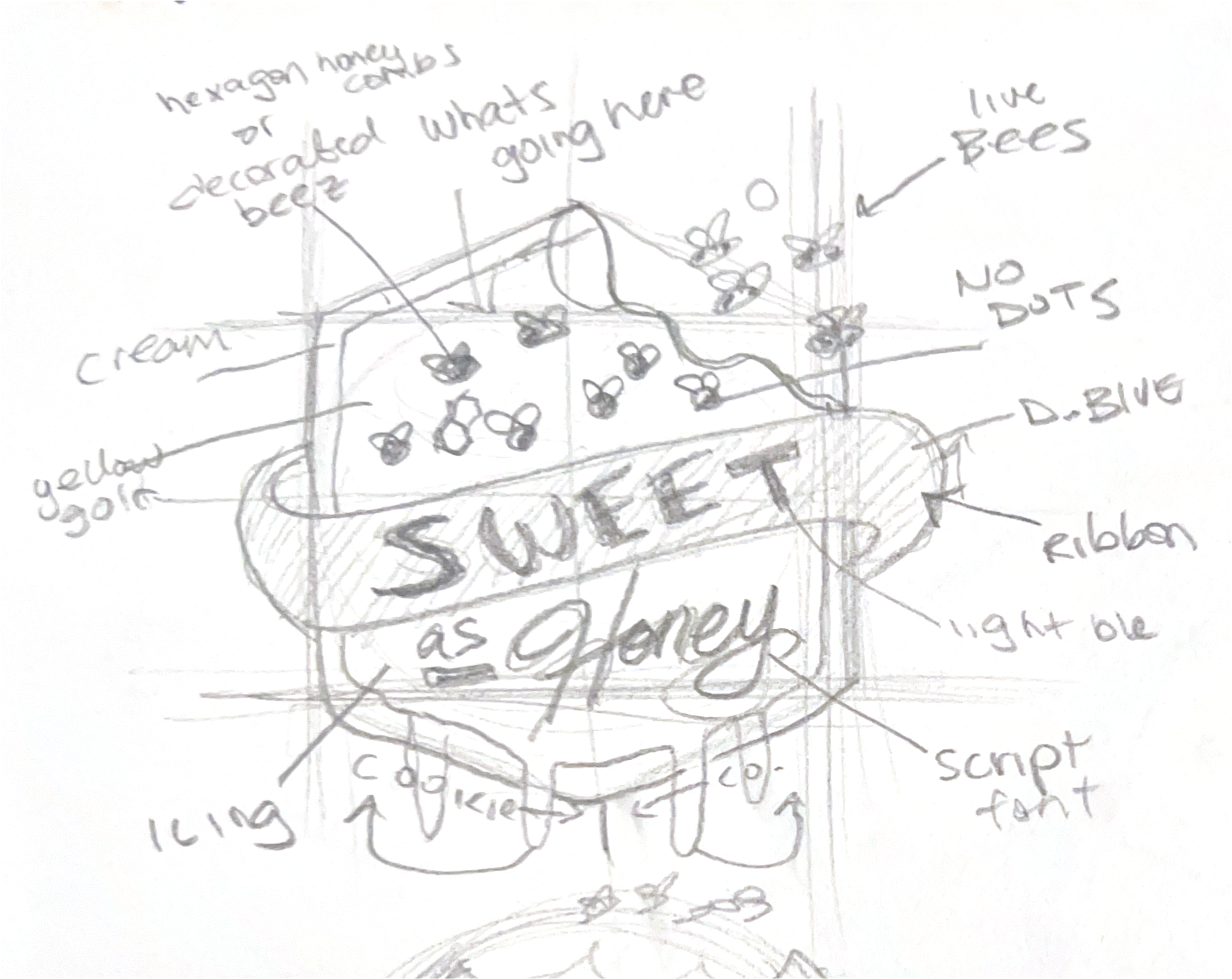
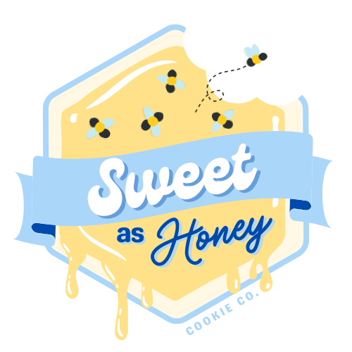

The Design
The logo leans into illustrated detail without feeling busy. Every element earns its place. The bees were positioned close to the cookie mark to create a sense of movement and life, like the brand itself is in motion. Line weight was kept consistent and slightly bold so the mark could hold up at small sizes, on sticker labels, social profile images, and anywhere the brand lives at a thumbnail. The illustrated style was the right call here because Nina's business is personal and handcrafted, and a cleaner or more geometric mark would have lost that feeling entirely.
Daisy Desi
#FFE086
Droplet
#A9D6F9
Shipmate
#739ED5
Black
#00000
The Outcome
weet As Honey Cookie Co. now has a visual identity that feels as handcrafted as the product. The logo lives across her website, social media, and packaging, stickers, cookie boxes, etc.